Lindsey·Frein
Home
Case Studies
About
Resume
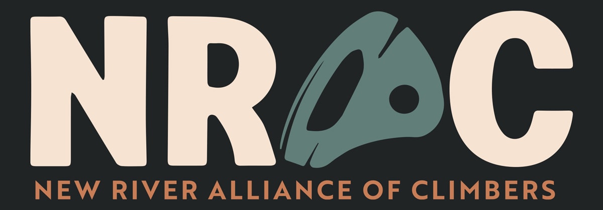
New River Alliance of Climbers Case Study
Website Redesign Empowering Usability and Fundraising
The New River Alliance of Climbers (NRAC) needed a website that could better support its mission of protecting climbing access throughout the New River Gorge by driving donations and engagement. I led a full website redesign and brand refresh focused on supporting fundraising efforts, driving revenue through merchandise sales, and improving access to educational resources.
I owned the full end-to-end redesign, created a scalable design system, and drove measurable impacts. This included a 31% increase in donation conversions and 37% increase in merchandise sales, directly contributing to the nonprofit’s ability to support climbing access and conservation work. I also expanded access to climbing resources such as maps resulting in 65% engagement rate with land access resources.
Overview
GOALS
- Increase donations to support conservation efforts.
- Drive merchandise sales through the online store.
- Improve discoverability of land access resources.
- Establish a more recognizable and authentic brand.
PAIN POINTS
- Poor Usability: weak content hierarchy, hidden resources, inconsistent typography and styling
- Low Conversion Potential: no clear CTAs, merchandise buried within the site.
- Lack of Brand Recognition: no cohesive visual identity, limited emotional connection to the community.

ROLE
Lead UX/UI Designer
Brand Designer

TIMELINE
1 Month

DELIVERABLES
Website Redesign
Design System Style Guide
Logos
Climbing Map

RESPONSIBILITIES
Information Architecture
Website Design
Mapping & GIS Collaboration
Graphic Design
Original Design
New Redesign
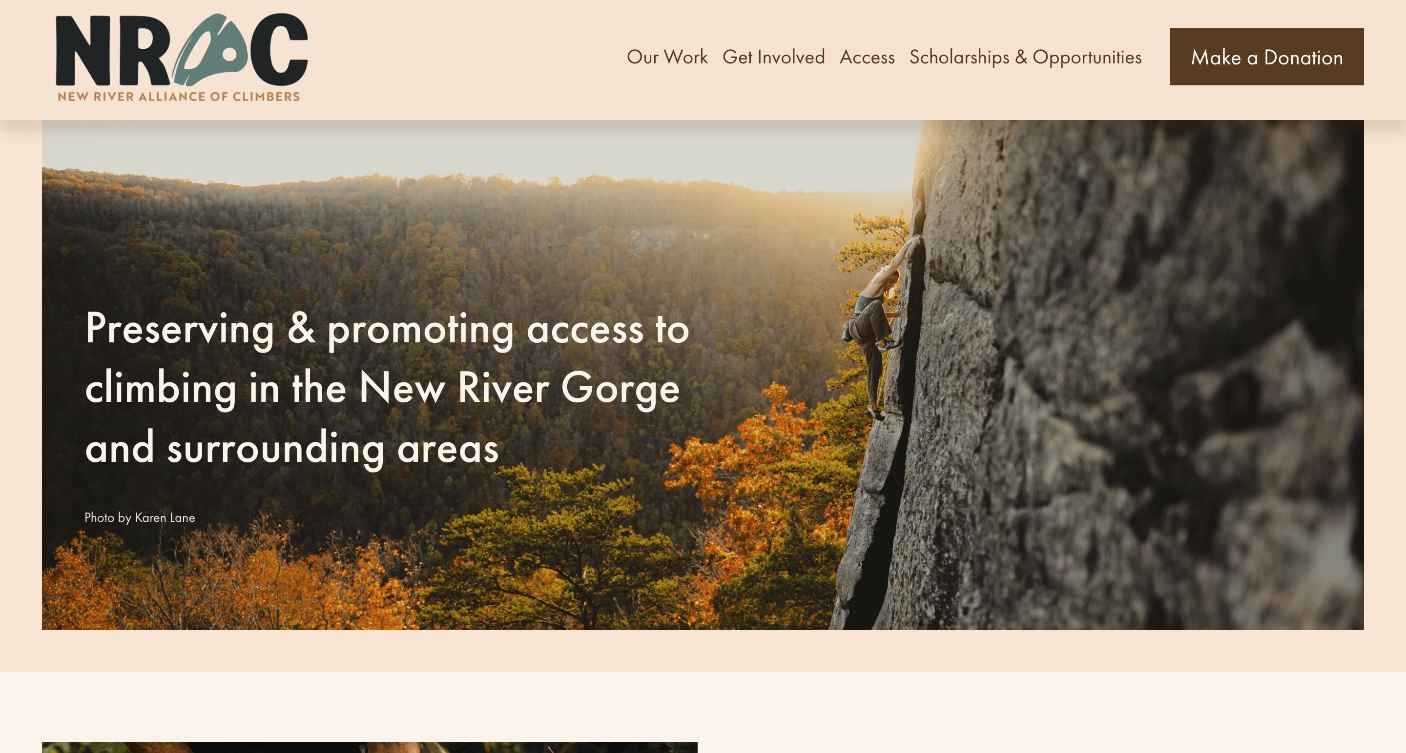
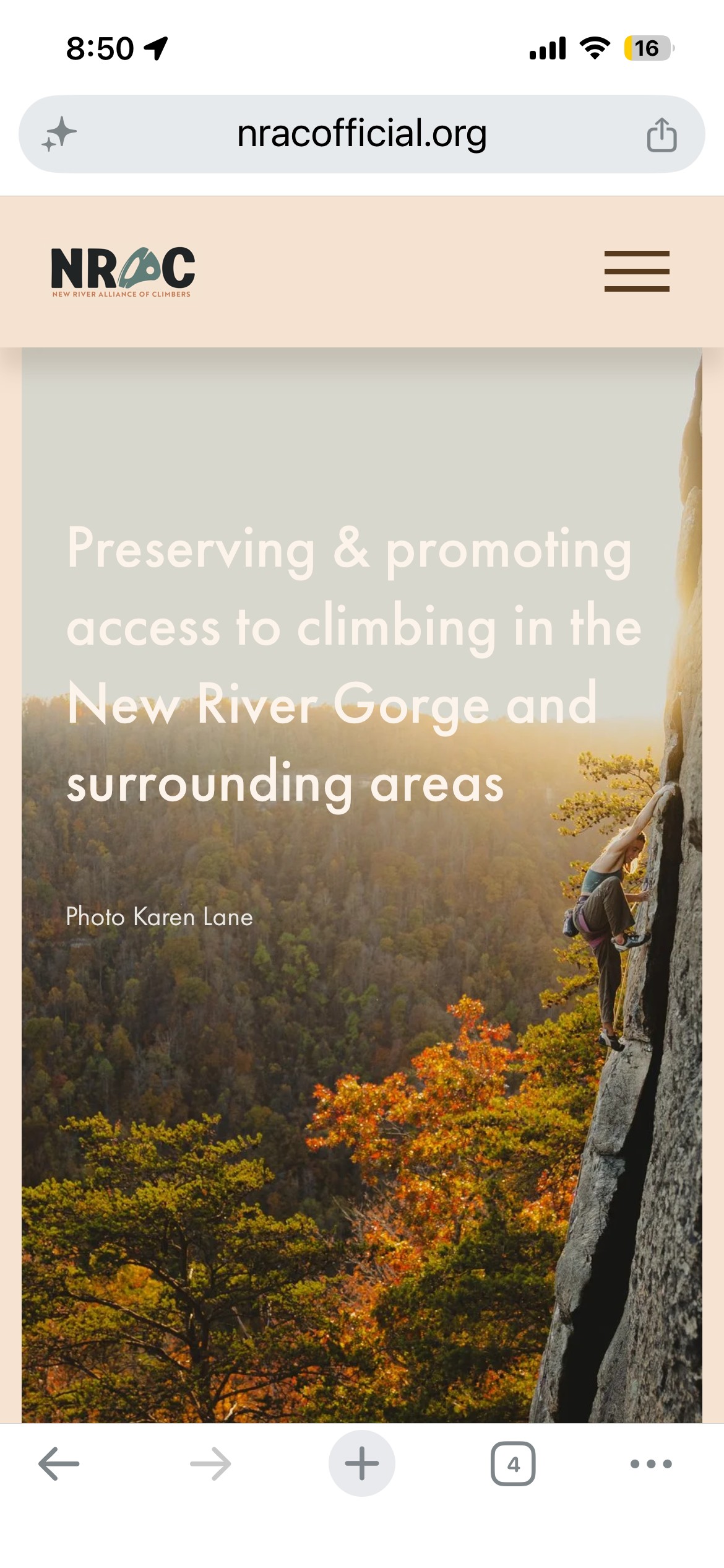
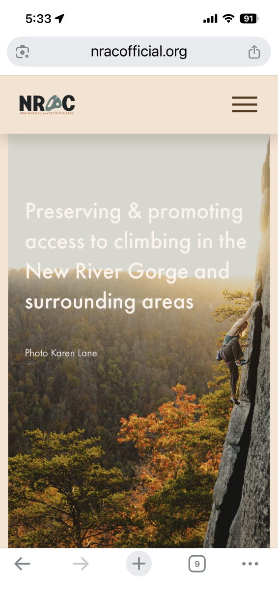
HOME PAGE
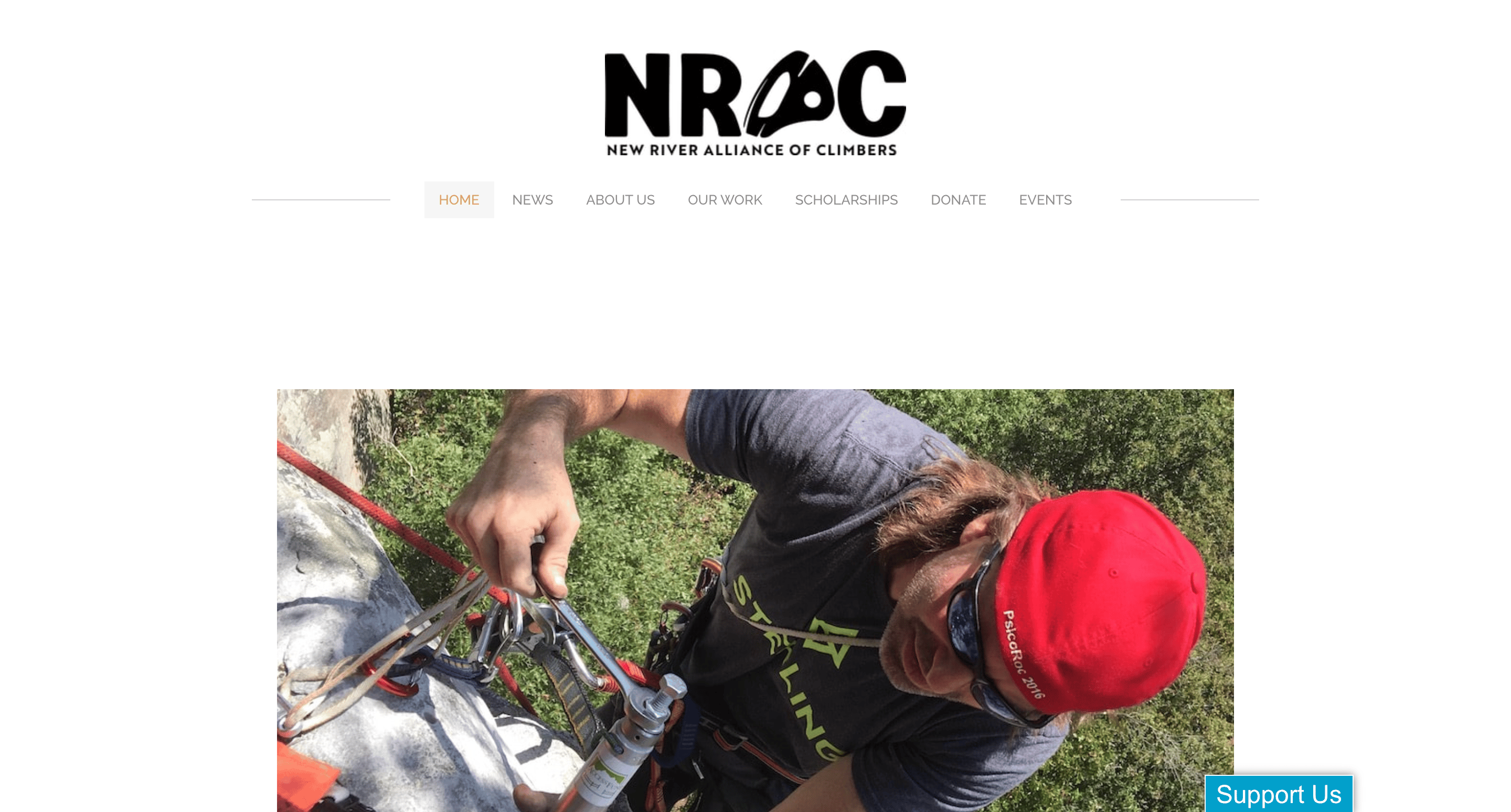
Old
Navigation unclear and repetitive, weak primary CTA, bland color and branding.
New
Navigation highlights key pages, bold CTA for donations, implemented cohesive outdoorsy palette & brand.
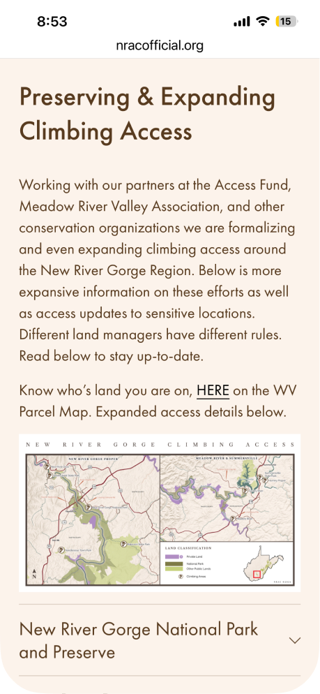
Mobile Addition
Old website did not support mobile so redesign, now mobile first. Many users are on the go and require live access to resources!
The Challenge
While NRAC had a strong presence within the climbing community, its website struggled to convert visitors into donors, customers, and advocates. A heuristic evaluation revealed usability issues, including unclear navigation and weak information hierarchy that made critical resources difficult to discover. The lack of a cohesive brand identity further reduced trust and engagement, limiting the organization's ability to generate revenue and communicate its mission effectively.
HEURISTIC REVIEW
- Navigation Bar doesn’t organize content effectively according to goals.
- Poor photo quality, lacks photo descriptions for accessibility.
- Too much white space.
- Paragraphs are offset randomly-content should follow F pattern.
- Lacking header/banner to greet visitors.
- Contrast is minimal-hard to read. Consistency, colors, and branding are not cohesive.
- Floating CTA feels random, lacks hierarchy and emphasis.
- Colors change halfway. Poor readability, not WCAG compliant for accessibility.

PROBLEM STATEMENT
Website lacked a cohesive brand identity, clear user pathways, and conversion points. Resources were difficult to discover, limiting NRAC’s ability to educate climbers and generate revenue.
POSSIBLE SOLUTION
Create a modern, mission-driven experience that strengthens the NRAC brand while making it easier for users to donate, shop, and access climbing resources.
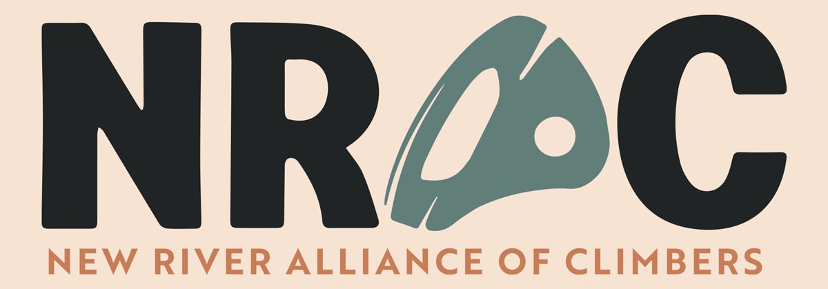
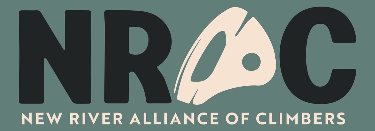
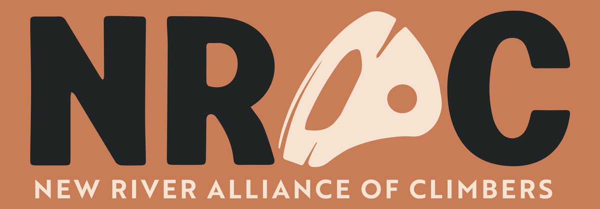
Building a Brand
A stronger brand was foundational to increasing trust, engagement, and support. I developed a refreshed visual identity and scalable design system that established consistency across the website and future organizational materials.
LOGO COLOR PALETTE
#f6e3d2
Chalk & Stone
Background tone from the cliff face. No generic neutral.
#617e79
River & Canopy
New River water in low light. Contrast without going cold.
#c87d56
Sandstone & Soil
Gorge's defining rock color. Warm, grounded, specific.
#202425
Shadow & Coal
Near-black that pulls from the rock - no flat default.
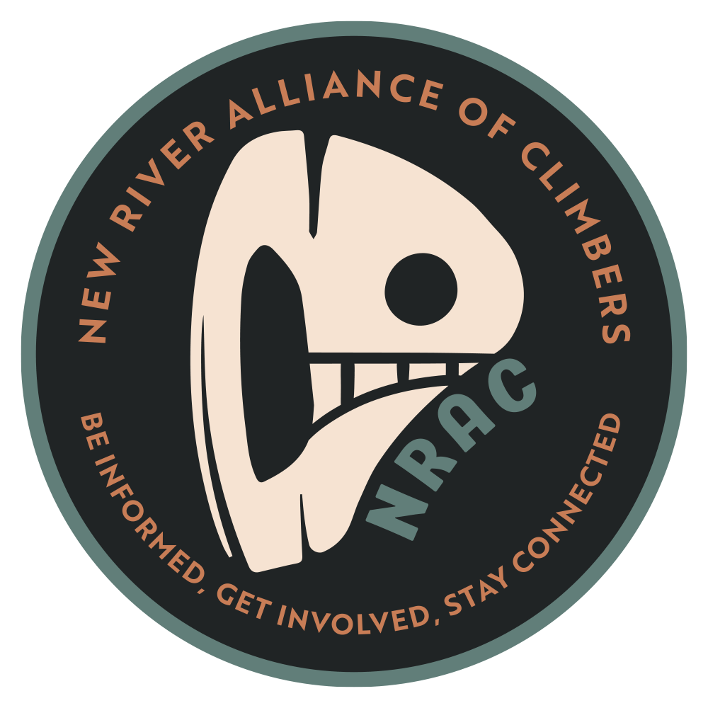
LOGO EVOLUTION
Goal:
Establish authentic brand, increase recognition, build trust.
Action:
Created a flexible visual language inspired by the New River Gorge's landscape, climbing culture, and conservation mission.
Result:
Hardware-inspired bolt motif featuring iconic New River Gorge bridge. Works as wordmark, badge, or standalone icon.
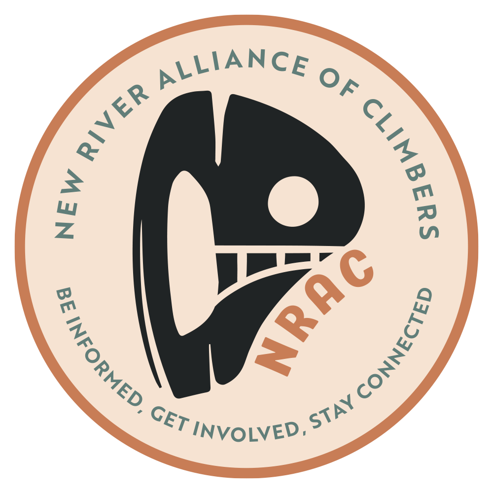
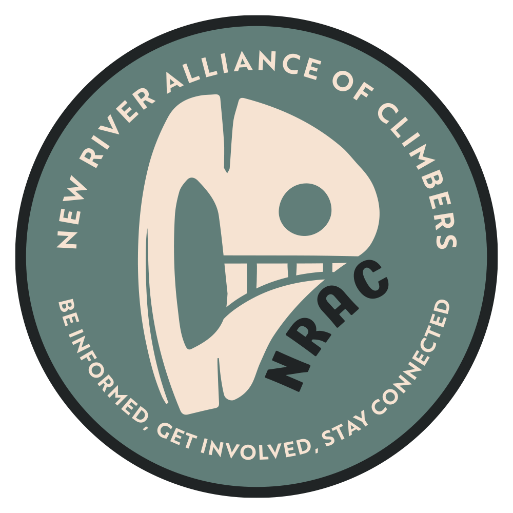
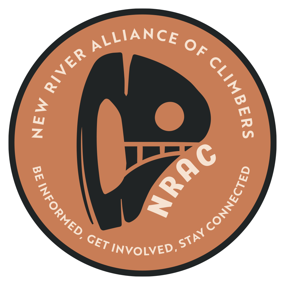
FROM LOGO TO MAP: SYSTEM CONNECTION

Expanding for Map Palette
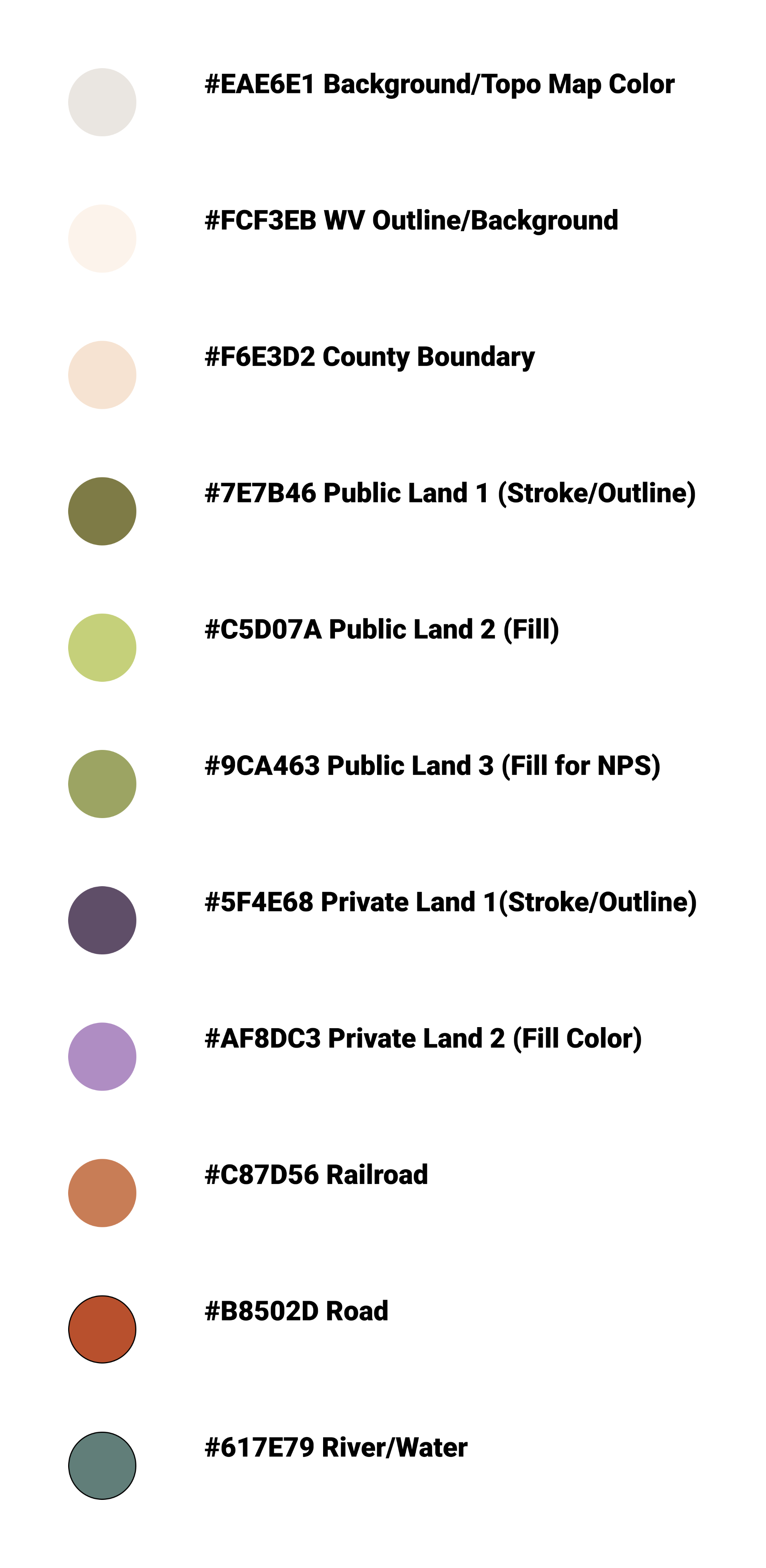
Extended Into

Map Key
OUTCOMES
65% ENGAGEMENT

Engagement rate with land access resources after launch.
1 SYSTEM

Consistent visual language across brand, site, and map.
Goals 3 & 4
SUPPORTS GOALS

Unified branding and resource discovery through a cohesive visual experience.
By treating the logo as infrastructure rather than decoration, the brand system could do real functional work. Making land access information more legible, and NRAC more recognizable to the climbers it serves.
Designing for Action
CLIMBING ACCESS EDUCATION
Goal 3
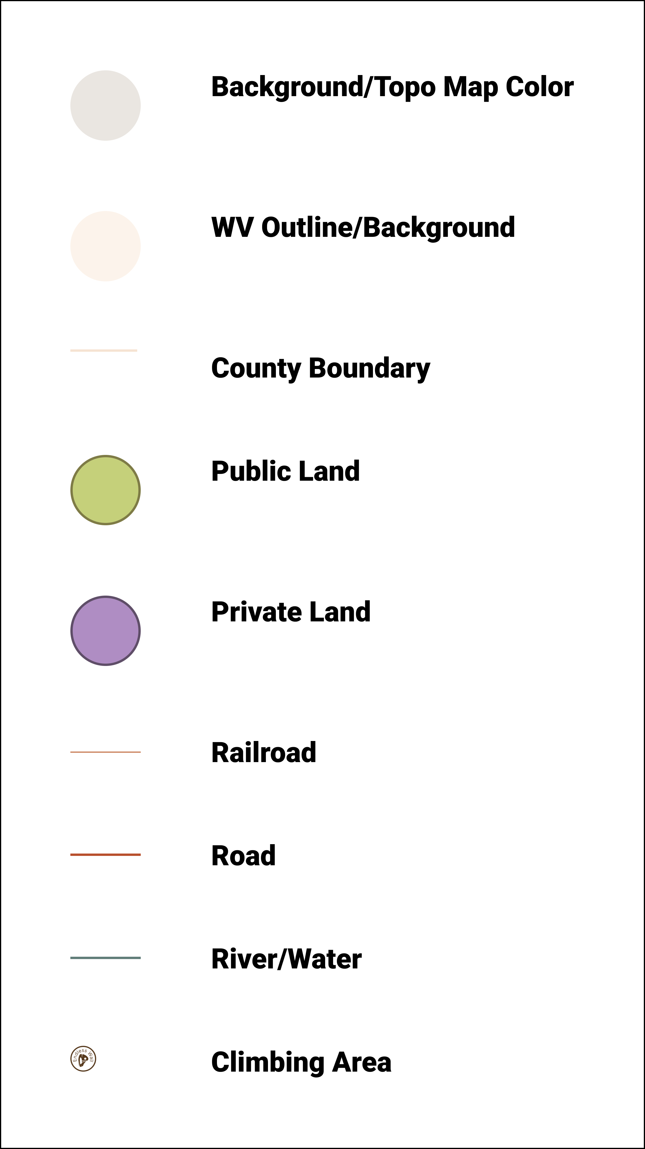
Land Access Map
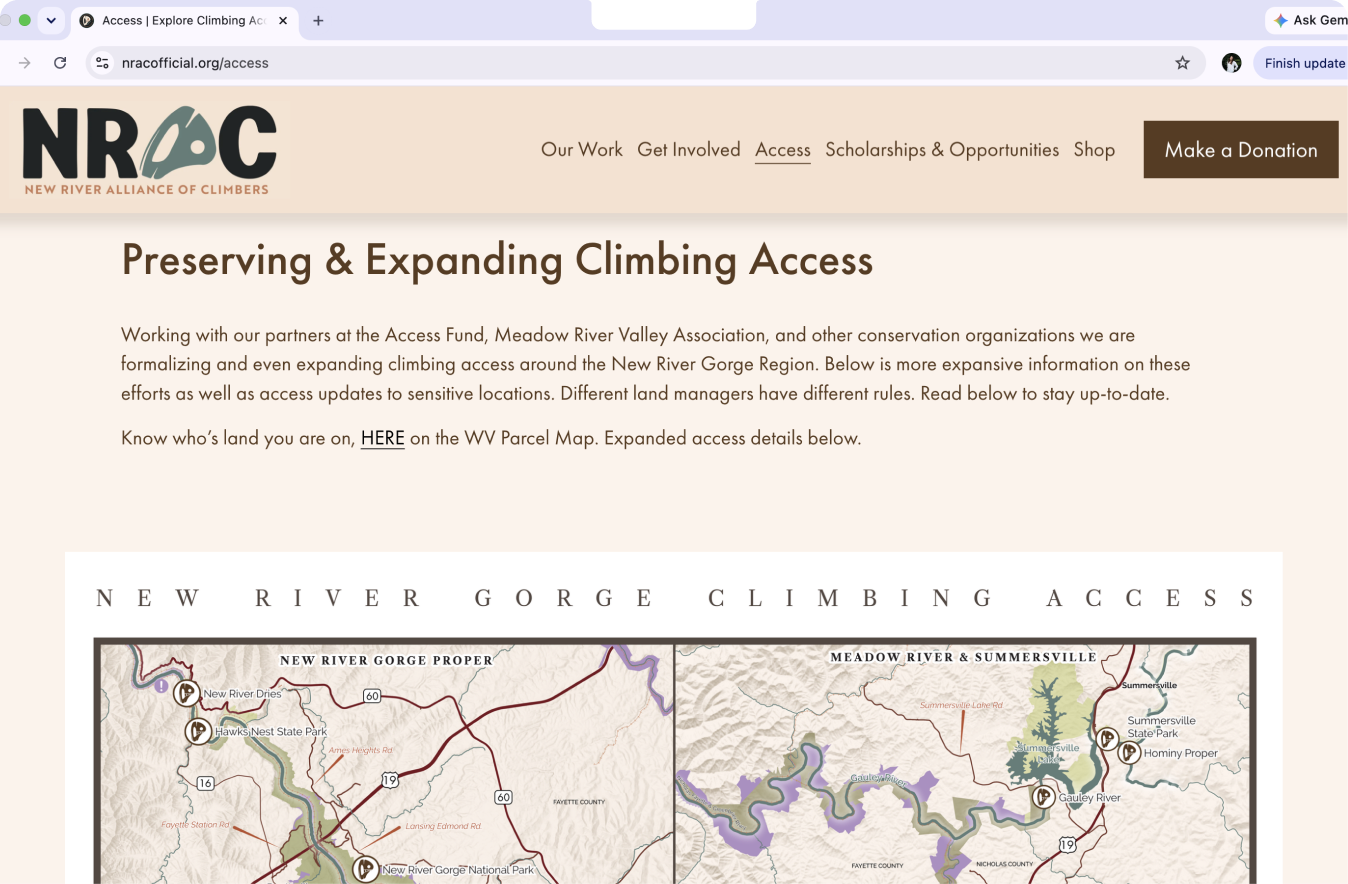
To improve climber education and support advocacy efforts, I designed a map that makes land ownership and access information easier to understand and explore. Ongoing negotiations over private land use have already led to the closure of 12+ crags and 300+ routes, making it especially important for climbers to understand and respect land ownership boundaries and access restrictions.
Inspiration
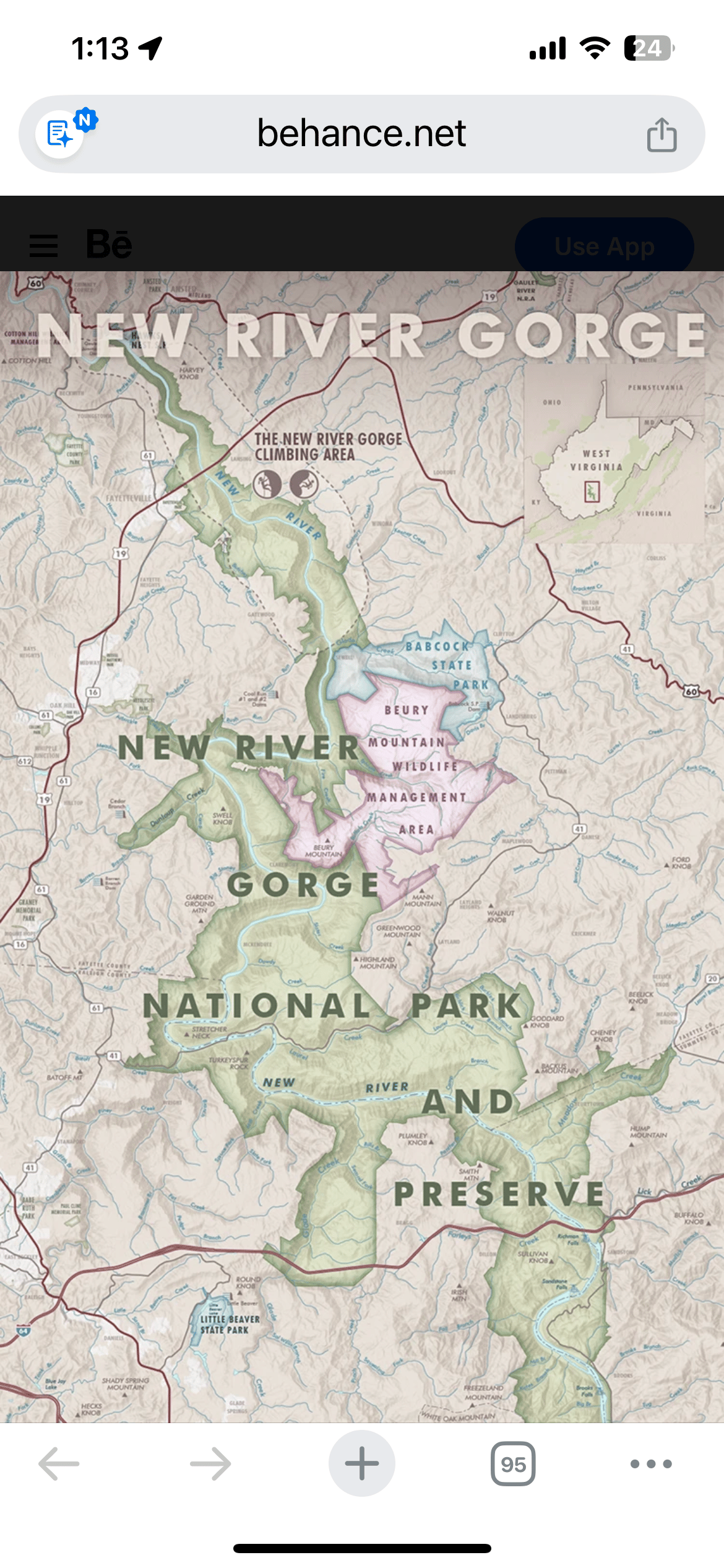
Early Iteration
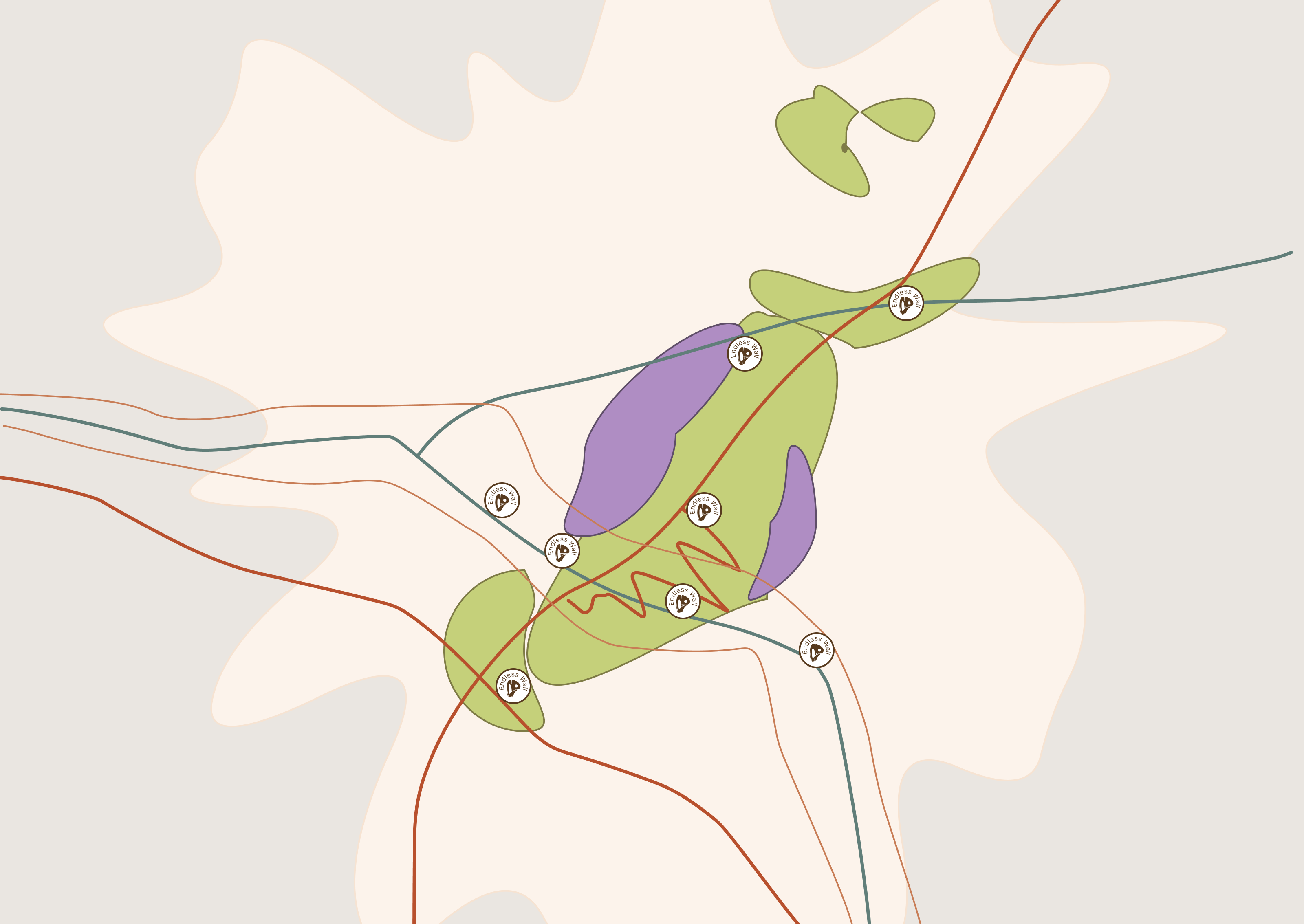
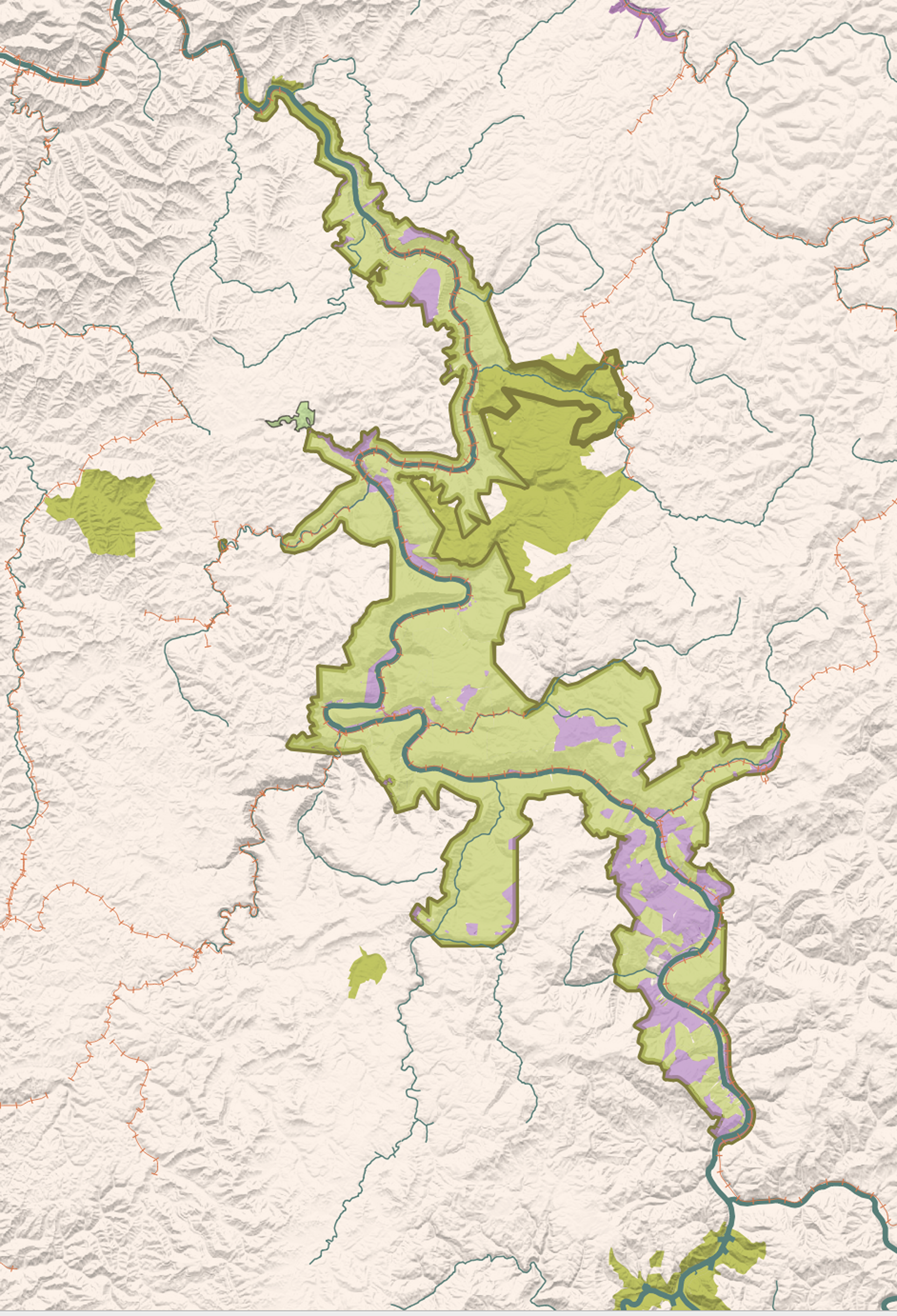
Final Design Visual: Climbing Land Designation Map
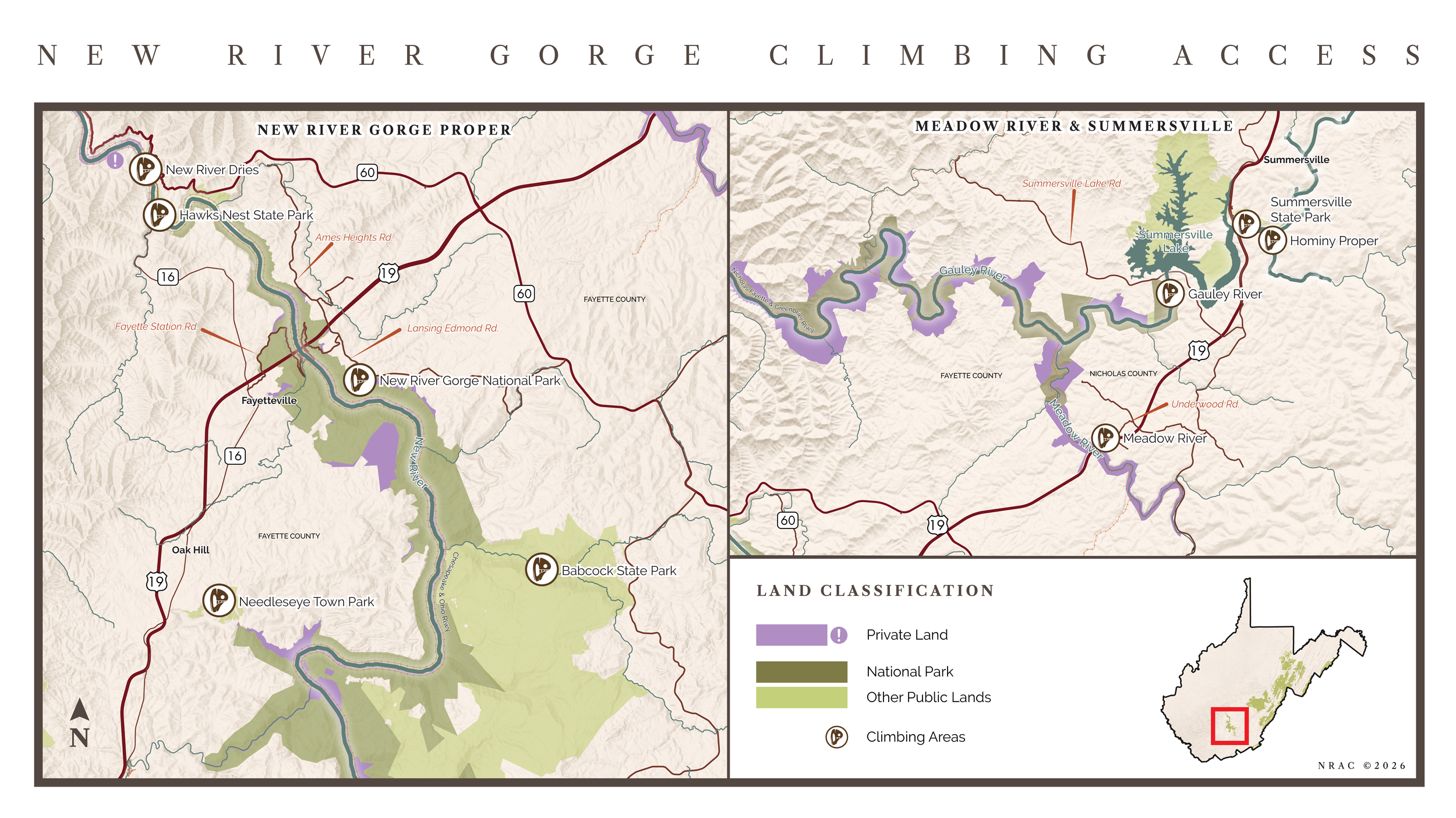
Implementation in Website
REVENUE GENERATION
Goals 1 & 2
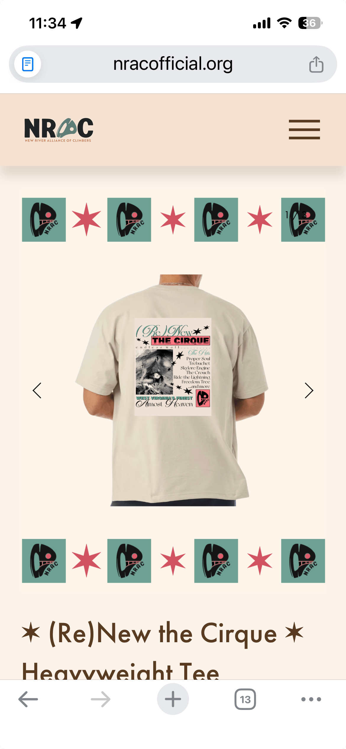
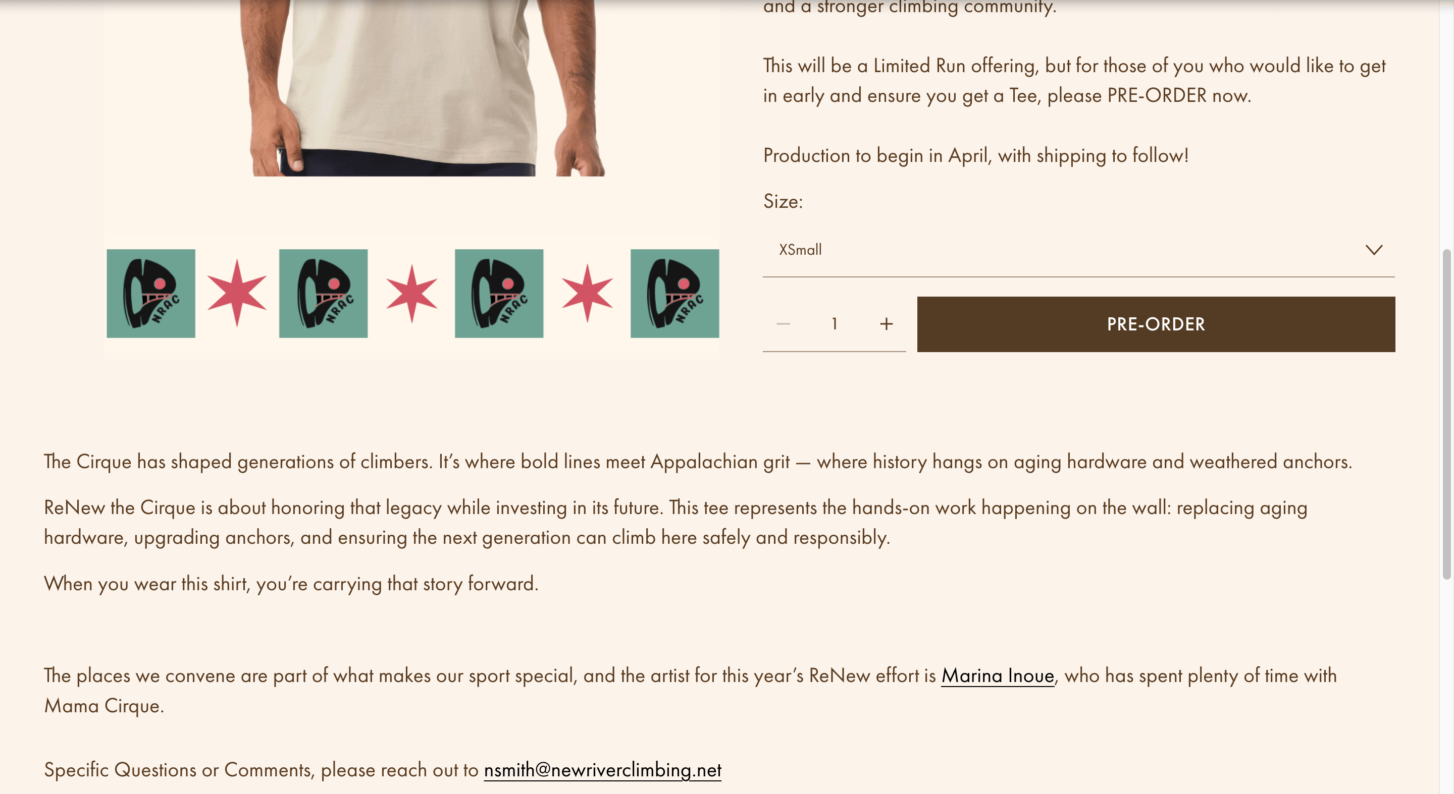
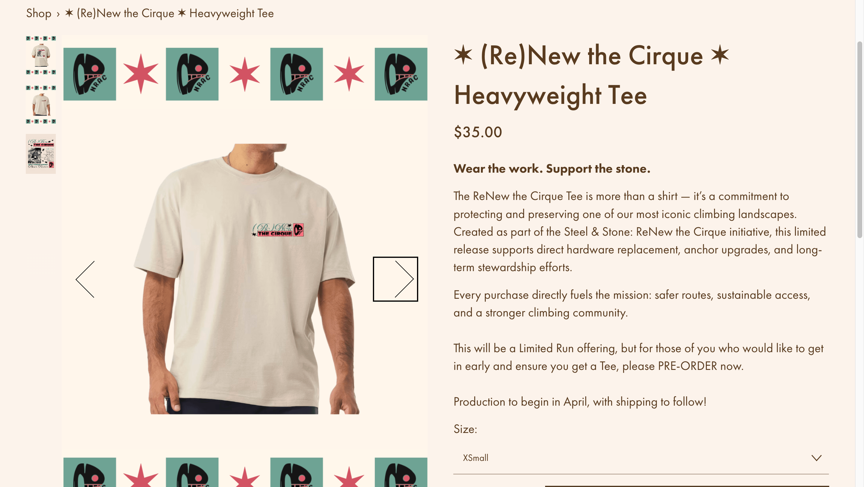
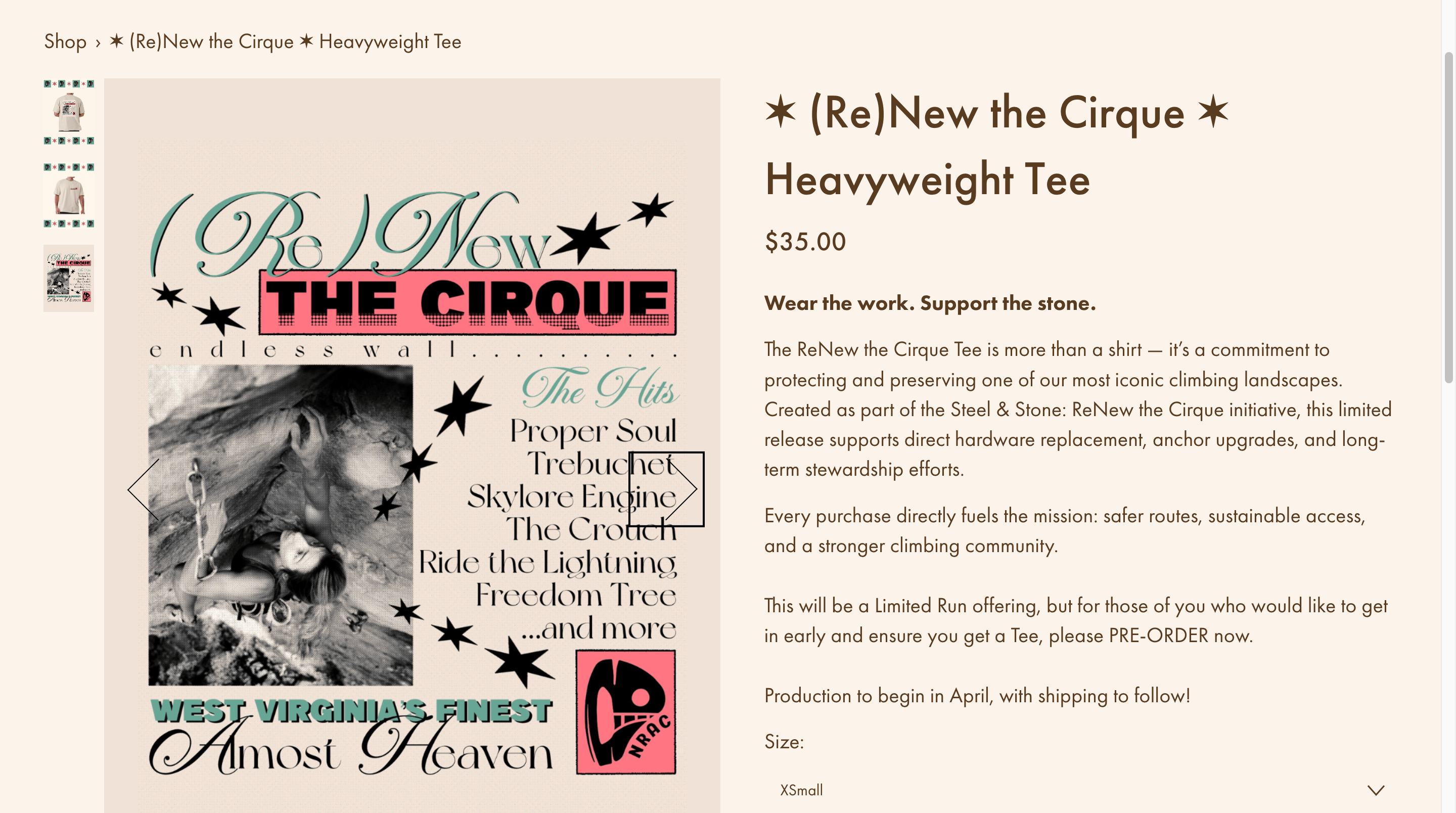
Donations & Shop
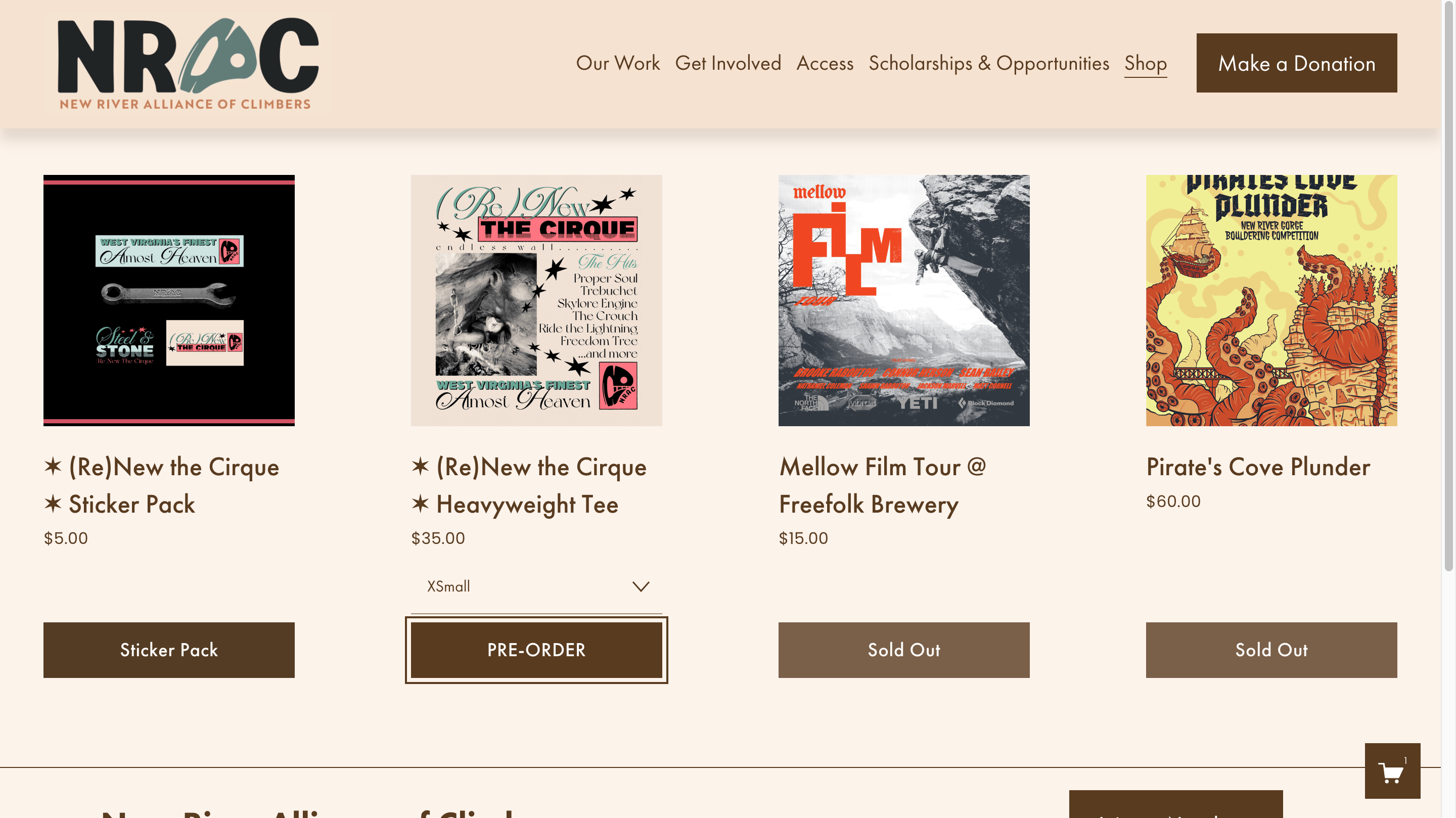
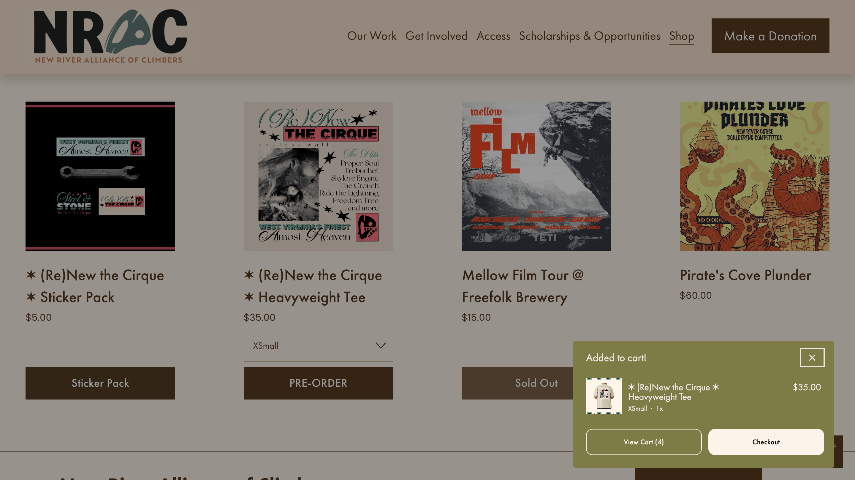
Donation opportunities were surfaced at every key moment: homepage hero, navigation, and post-content, rather than living on a single buried page. The merchandise store was redesigned as a primary destination. Elevated in navigation, with product pages that connect each item to NRAC's mission.
Shop Overview Page
Add to Cart
Product Page (Top)
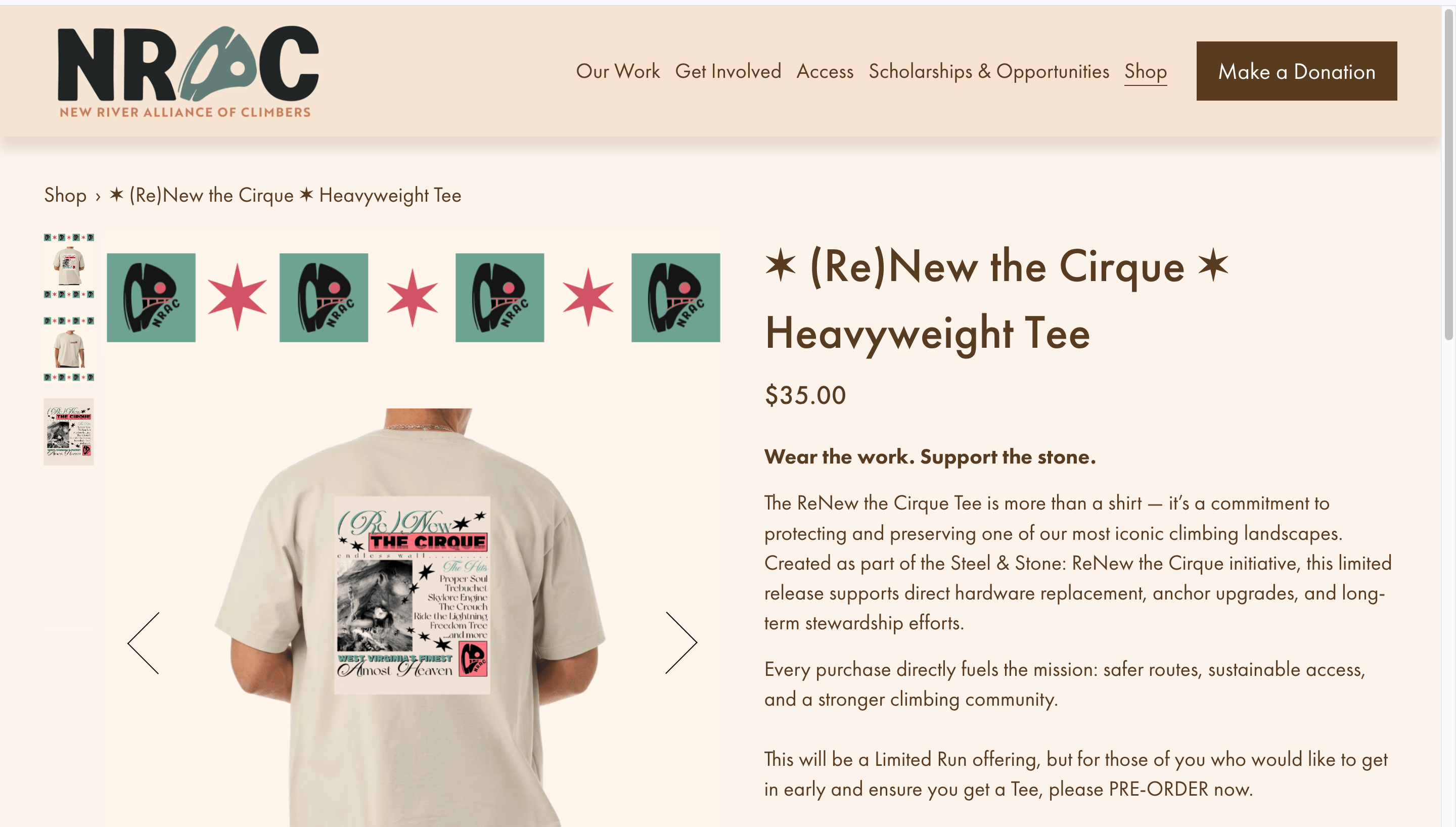
Product Page (Scrolled to Bottom)
Merchandise Image Scroll (2 Shirt Front)
Merchandise Image Scroll (3 Design Close Up)
Impact
Donation Conversions
+31%
By surfacing donation CTAs throughout the site rather than burying them
Merchandise Sales
+37%
By elevating the shop to a primary nav destination with improved product pages
Map Engagement Rate
65%
NRAC's first dedicated land access resource, designed to replace a buried PDF
KEY OUTCOMES

Donation revenue grew, directly funding conservation and anchor replacement programs.
Merchandise became a viable revenue stream with a 37% sales increase.
A scalable design system established a NRAC’s brand identity that extends across the site, map, and future materials.
All four project goals met: donations up, merchandise sales up, land access discoverable for the first time, and a brand climbers can recognize and trust.
Reflection
Working within a nonprofit's constraints: limited budget, no dev team, a volunteer-run organization, pushed me to prioritize ruthlessly. The biggest lesson: design decisions that serve the mission (access, conservation) and business goals (donations, merch) don't have to compete. Here they reinforced each other.
Next Case Study
Medlaunch Concepts
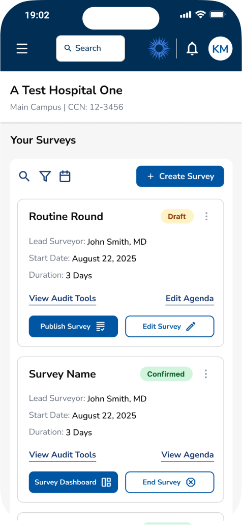
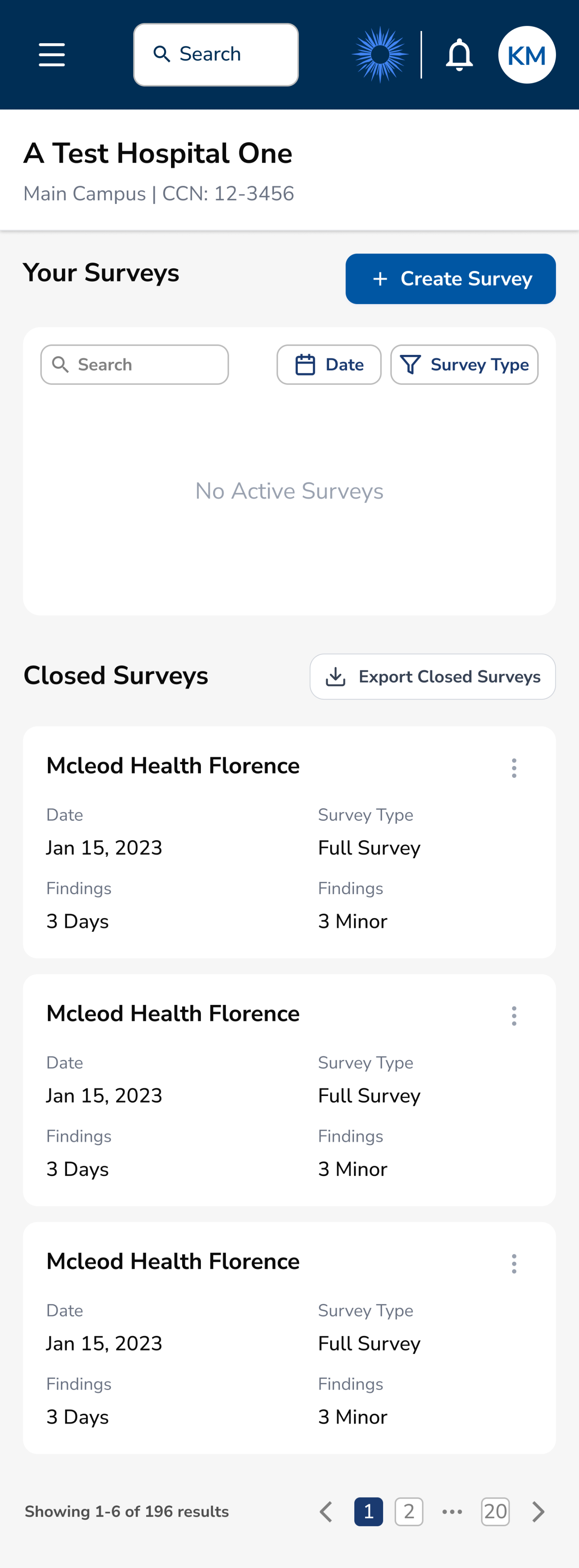
Optimizing Survey Tool based on Usability Testing Research
Survey tool optimization through usability testing, resulting in more intuitive, efficient, and effective survey tools for users.
Usability Testing
Healthcare
B2B SaaS
Product Design

+40%
Improved SUS
+37%
Task Success Rate
View Case Study