Medlaunch Case Study
Optimizing Survey Tool based on Usability Testing

I collaborated in the testing of Medlaunch’s survey tool and took leadership of redesigning this flagship product. Partnering with product, engineering, and data teams I ensured alignment with business goals, user needs, and scalability. I also took ownership of a scalable design system to maintain consistency as we continued to expand our in app-products and services.
Through cross-team collaboration, we delivered a full product redesign in under two sprint cycles, improving task success rates and usability for customers while directly contributing to securing a new client contract for Medlaunch.
Goals
01. Improve task success rates for survey workflows.
02. Simplify core accreditation flows to reduce cognitive load and support success in hospital demos.
03. Create scalable UX patterns to support long-term product growth and evolving user needs.
Original Design
New Redesign
Overview

ROLE
Lead UX Designer

TIMELINE
Quarter 1, 2026 (1 Month)

COLLABORATORS
20+ team members:
UX Design, Product, Business,
Data, & Engineering.

RESPONSIBILITIES
Product planning, UX research,
UX & UI design
The Challenge
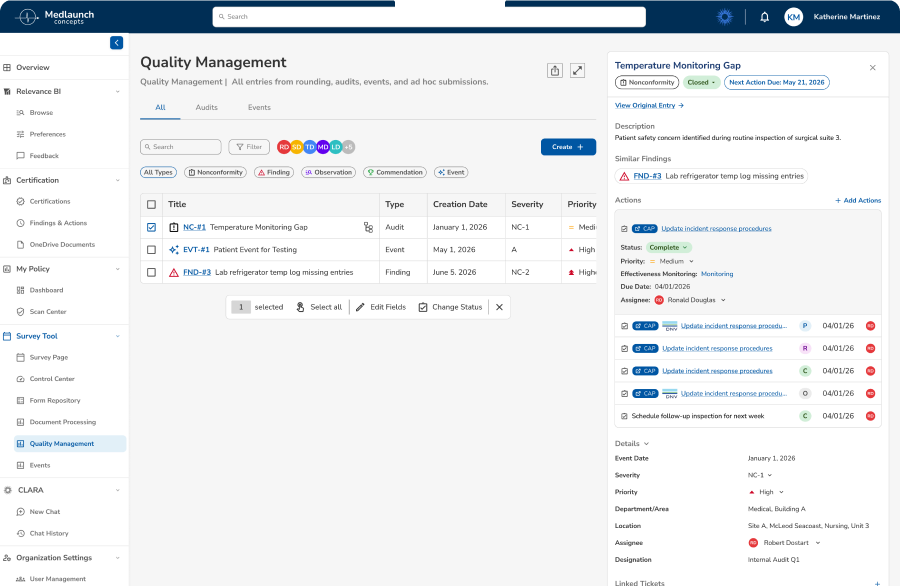
Medlaunch's DNV Healthcare Portal helps hospital administrators and DNV accreditors track active, closed, and ongoing surveys (audits for hospital compliance). However, users were experiencing significant friction in critical workflows.
Survey Page Major Issues:
Critical Pain Points

Consistent confusion around terminology, status, and labels.
Vague hierarchy and weak CTA buttons prevent efficient survey creation.
Lack of flexibility for customization and filtering.
Survey workflow unclear and rigid, without ability to fix errors.
Problem to Solve
BUSINESS NEED
Enhance the product rapidly to meet deadlines for live demonstrations, enabling Medlaunch to secure new contracts and generate revenue as a startup under one year old.
USER NEED
Optimize task workflows to enable users to efficiently complete critical activities such as survey creation and processing.
Research
My mission was to redesign the survey management interface and conduct comprehensive usability testing to identify and resolve critical workflow barriers that were preventing users from efficiently completing their tasks. I conducted moderated usability testing, including both quantitative metrics (task completion rates) and qualitative feedback (SUS questionnaire, user observations).
8
Participants
4
Tasks Tested
60-75
Minute Sessions
Usability Test Results
Task Completion Rates
1
Create New Survey
50%
2
Edit Survey Details
25%
3
Publish and View Survey
88%
4
Complete/Close Survey
63%
8
6
4
2
0


Task 1
Task 2
Task 3
Task 4
Pass
Fail
System Usability Scale (SUS)
Numbers in cells represent participant number
Disagree
Nuetral
Agree
1
2
3
4
5
1. I think that I would like to use this product frequently.
8
4-6
3, 7
1, 2
2. I found the product unnecessarily complex.
2-4
1, 7
8
5
3. I thought the product was easy to use.
2
1, 3-8
4. I think that I would need to consult a senior to be able to use this product effectively.
4-7
3, 8
1, 2
5. I found the various functions in this product were well implemented.
1, 2, 4
6-8
3, 5
6. I thought there was too much inconsistency in this product.
5
6
1-4
7, 8
7. I would imagine that most hospitals with a need to do audit and compliance would learn to use this product very quickly.
3-5, 8
7, 8
2
1
8. I found the product very cumbersome to use.
2-8
1
9. I felt very confident using the product.
2
1, 3
4-8
10. I would need to learn a lot of things before I could get going with this product.
4
3, 5-7
1, 2, 8
System Usability Score
59.4
D Marginal
Industry average: 68
User Confidence:
Low
Perceived Complexity:
High
Insights
Survey Overview Learnings
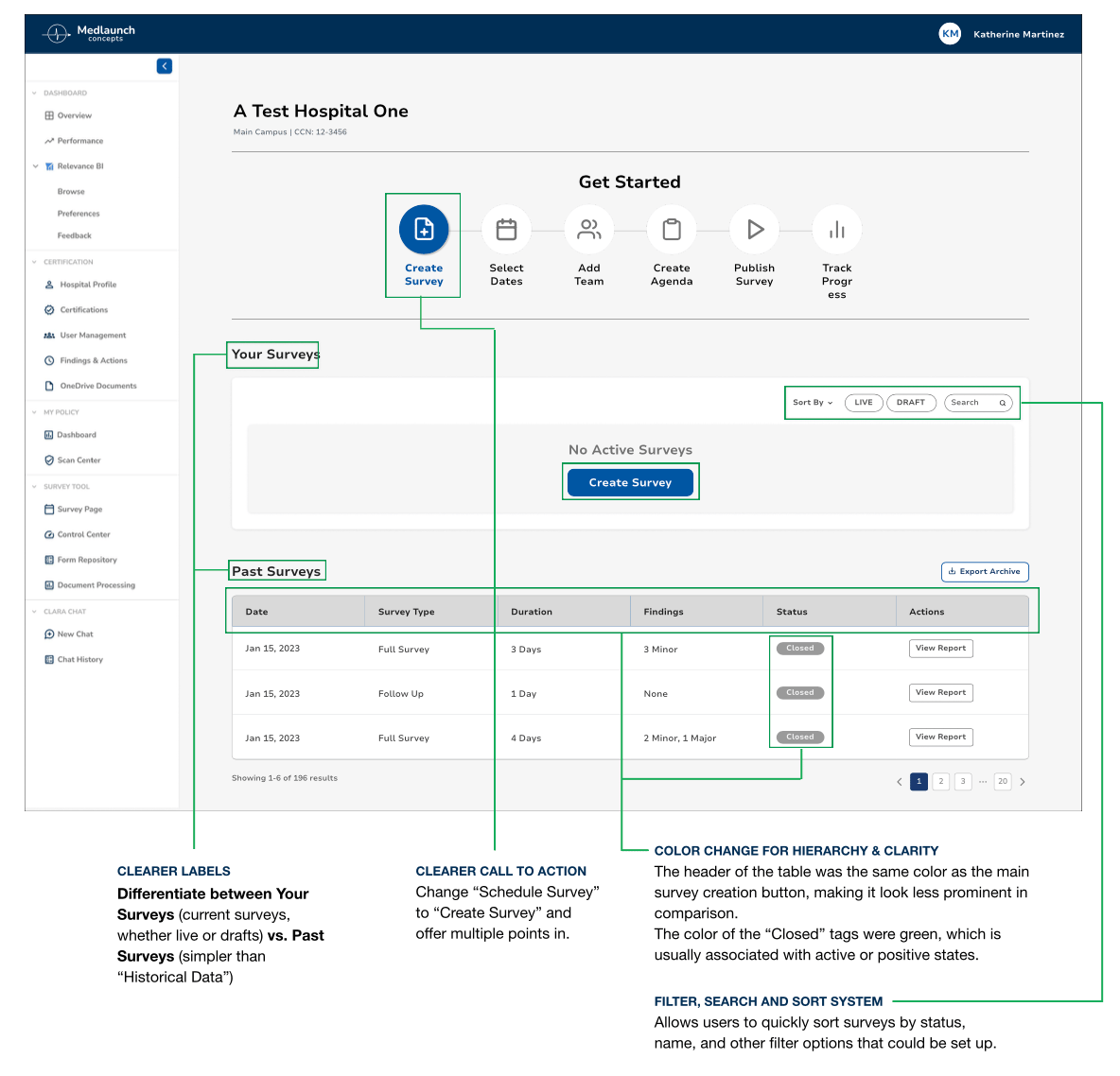
UNCLEAR TERMINOLOGY
Insight: Users were confused by button labels/actions.
Action: Simplified language based on testing. Created terminology style guide to ensure ongoing consistency.
VAGUE CALL TO ACTION
Insight: Users struggled to use “Schedule Survey” button.
Action: Update label text. Position more prominently, following familiar design patterns.
LACKING HIERARCHY & CLARITY
Insight: Color not used to convey meaning.
Action: Redesign color hierarchy to enhance usage.
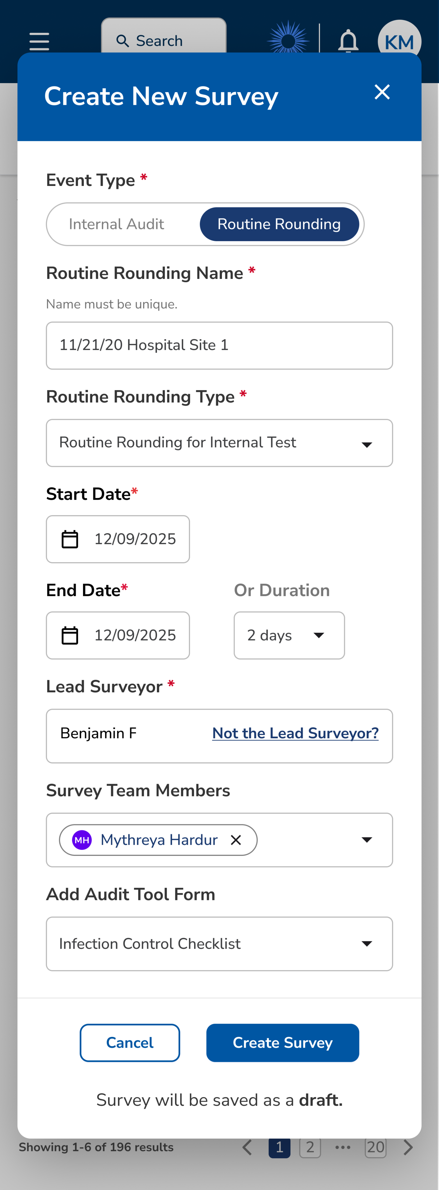
Survey Creation Form Learnings
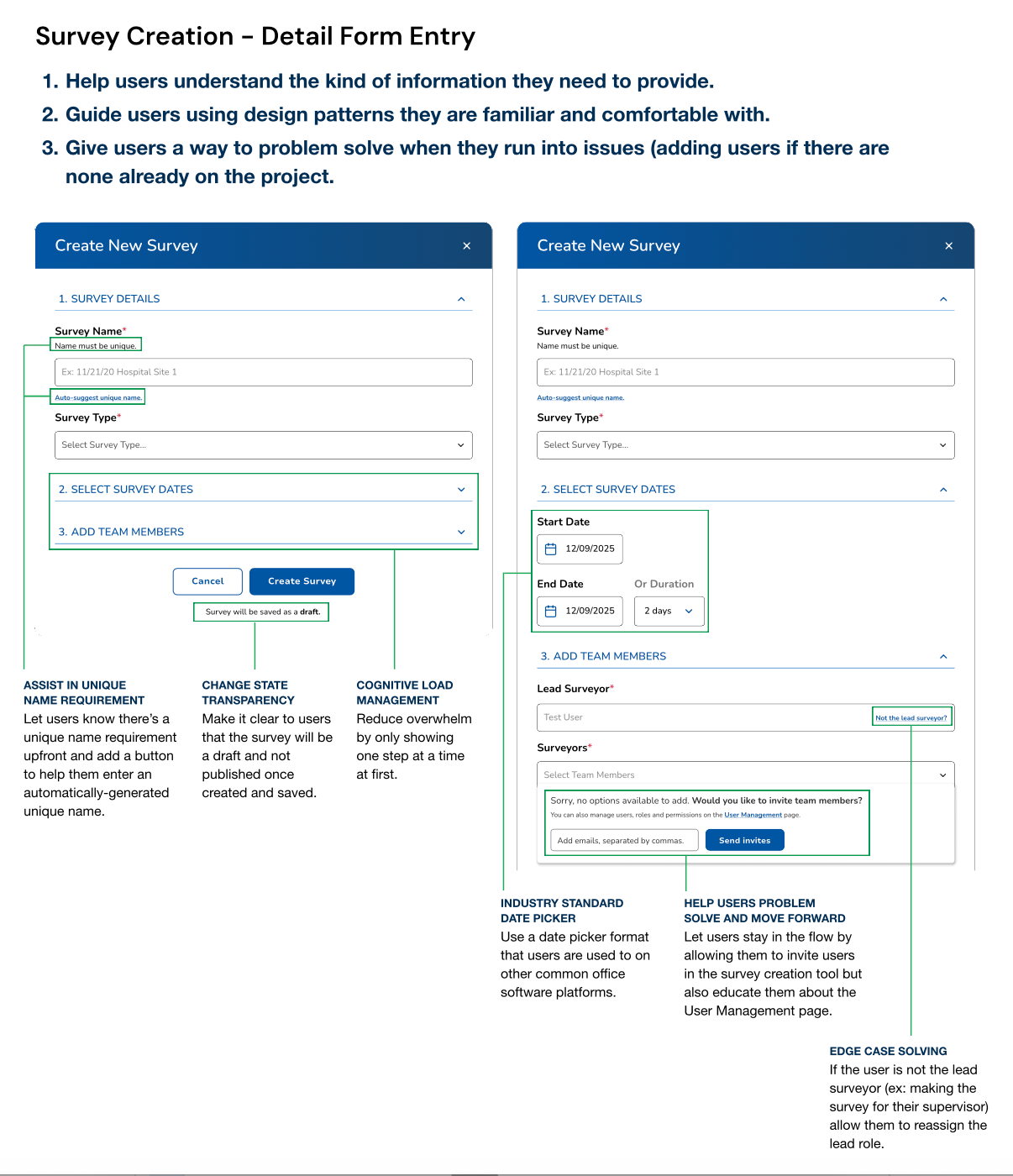
GUESSING REQUIREMENTS
Insight: Users lacked information about required fields.
Action: Implement input field subtext and edge case solutions.
UNFAMILIAR DESIGN PATTERNS
Insight: Users were confused by date picker UI.
Action: Convert to industry standards.
PROBLEM SOLVING
Insight: Users felt dead-ended when faced with adding teammates to a survey.
Action: Integrate invite users dropdown into flow without redirecting.
Survey Management Learnings
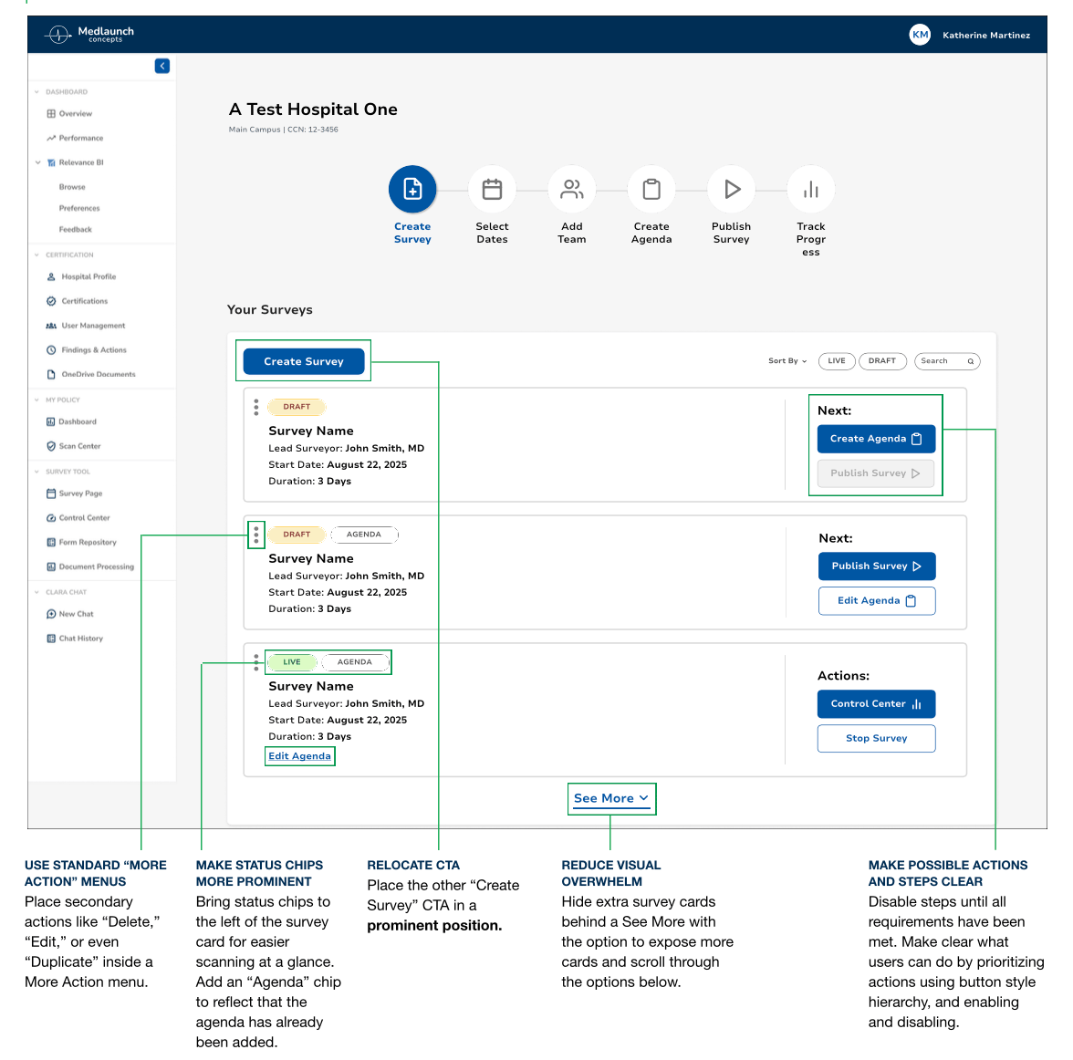
UNFAMILIAR PATTERNS
Insight: Users were overwhelmed by organization.
Action: Group like functions together and follow familiar design patterns.
UNBALANCED LAYOUT
Insight: UI like color or placement fail to convey meaning.
Action: Relocate CTA, status chips, actions. Hide unnecessary UI elements and data.
UNCLEAR NEXT STEPS
Insight: Users struggled to understand, complete, or undo actions in next steps.
Action: Update actions according to survey progress and disable buttons that are pending prior actions.
Key Objectives

Improve usability score from D (59.4) to B (70-80).
Increase task success rates with clearer labeling & workflows.
Reduce learning curve for new users with familiar patterns.
Prioritize customization to enable multiple success paths.
Design Process
Based on usability testing insights, I implemented an iterative design approach focused on addressing critical user pain points while collaborating closely with cross-functional teams to ensure technical feasibility and business alignment.
ITERATION
Based on Testing
Following initial usability testing results, I implemented targeted design improvements addressing each identified pain point. Changes included updating button labels, improving visual hierarchy, and adding missing functionality like search and filters.
Original Design
Iteration 1
Iteration 2
Iteration 3
COLLABORATION
Cross-Functional Partnership
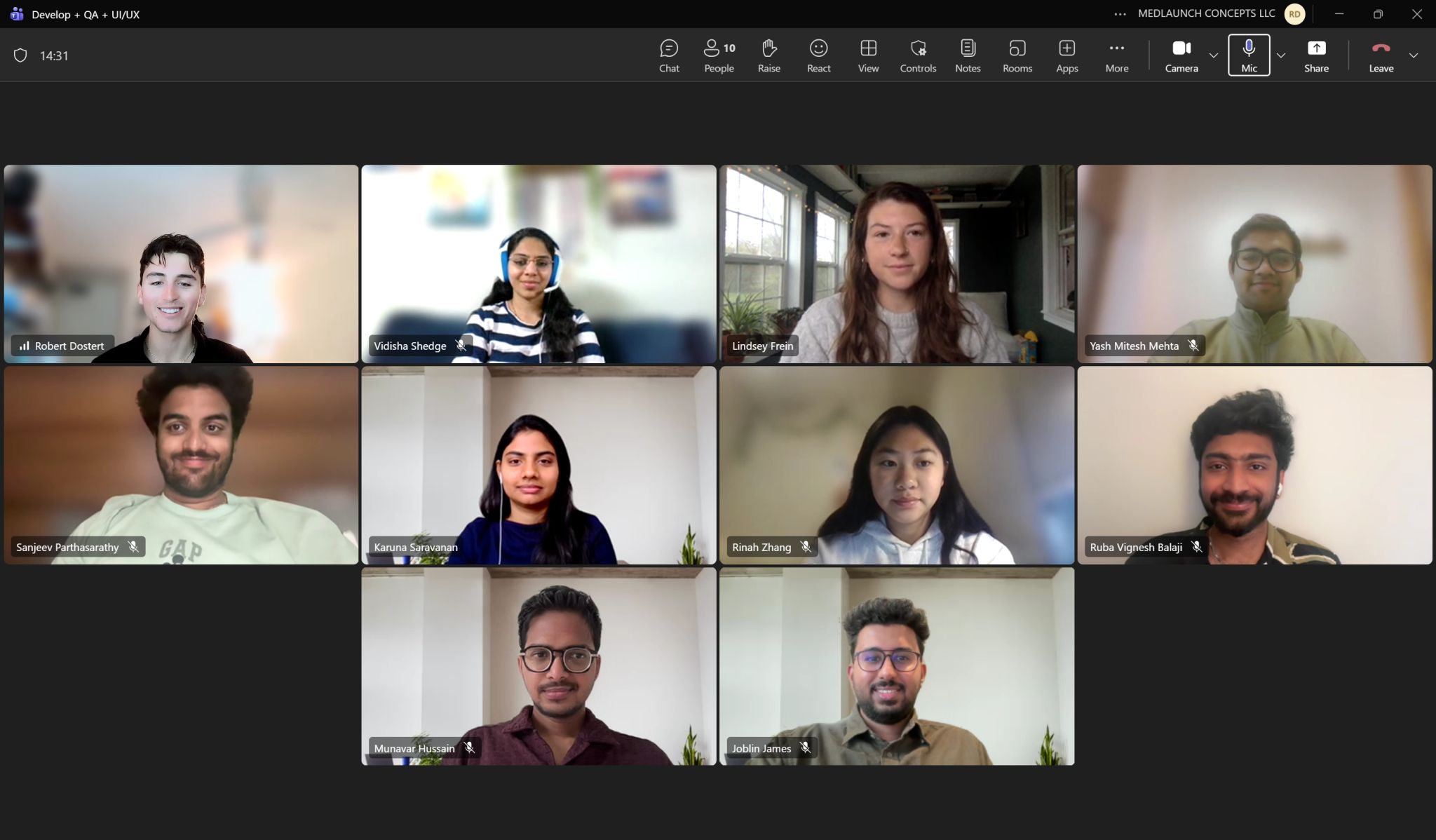
Collaborated closely with product managers on terminology and button label updates, worked with developers to streamline rapid handoff, and partnered with field team to ensure they understood upcoming demo changes. Regular check-ins balanced design goals with technical constraints.
Collaboration
TEAMWORK
We collaborated throughout the design process in small teams (e.g. product planning meeting of 3) and large (front-end group calls of 10+).
PRODUCT PLANNING
Major points in product meetings highlighted label terminology in the medical context and scalable design.
GUIDELINES, HANDOFF & SCALABLITY
Button labels and UI for this product were pushed system wide. Together we created documentation guidelines in our design system for terminology and components.
Product Planning & Terminology Guidelines
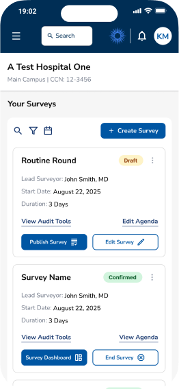
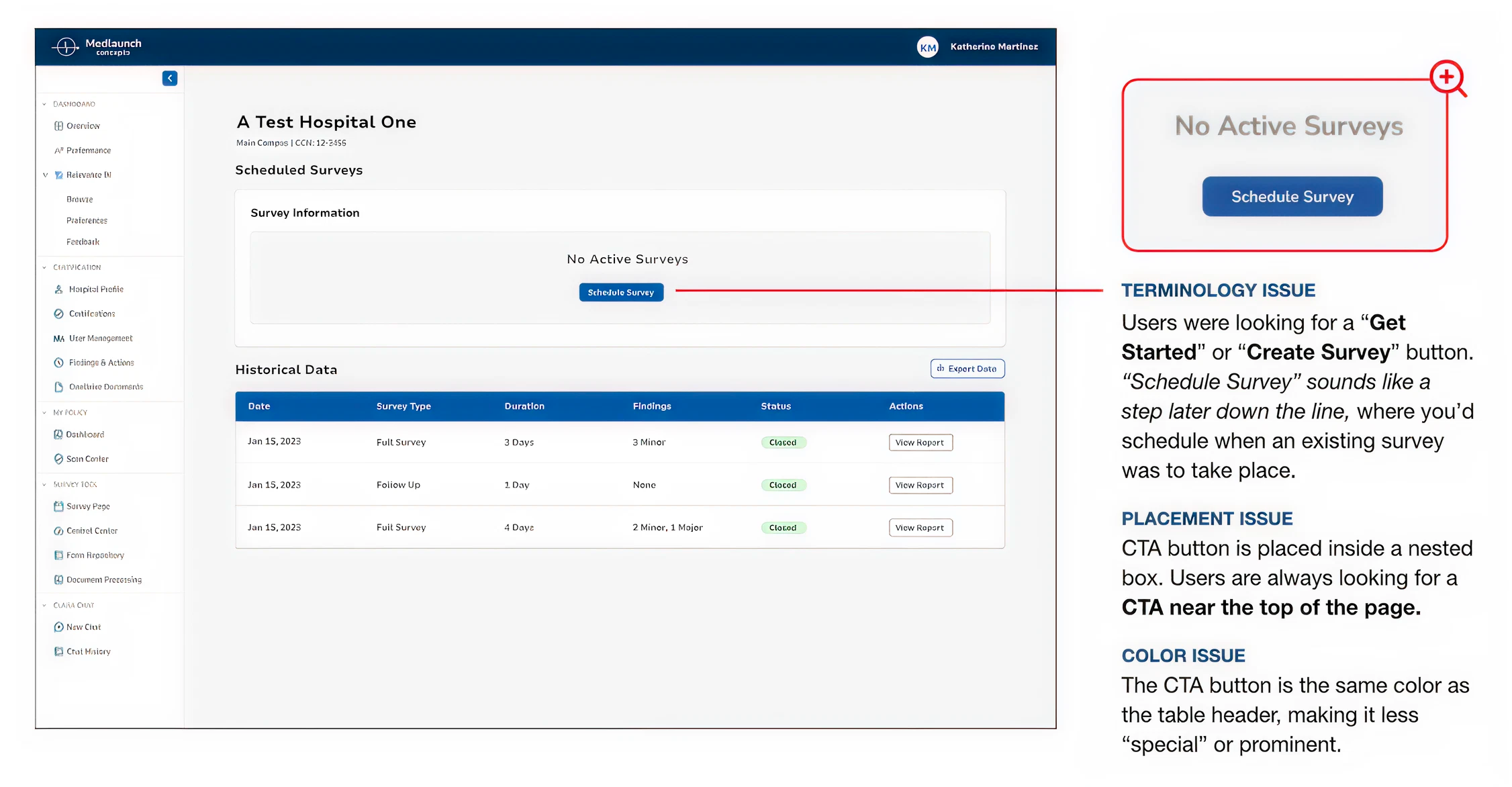
BEFORE: SCHEDULE SURVEY
Scheduled Surveys
Survey Information
No Active Surveys
Schedule Survey
“Schedule” implied setting a date/time only, not initiating a survey.
Users expected a calendar interface rather than a survey builder.
Ambiguous for compliance workflows where “scheduling” has specific regulatory meaning.
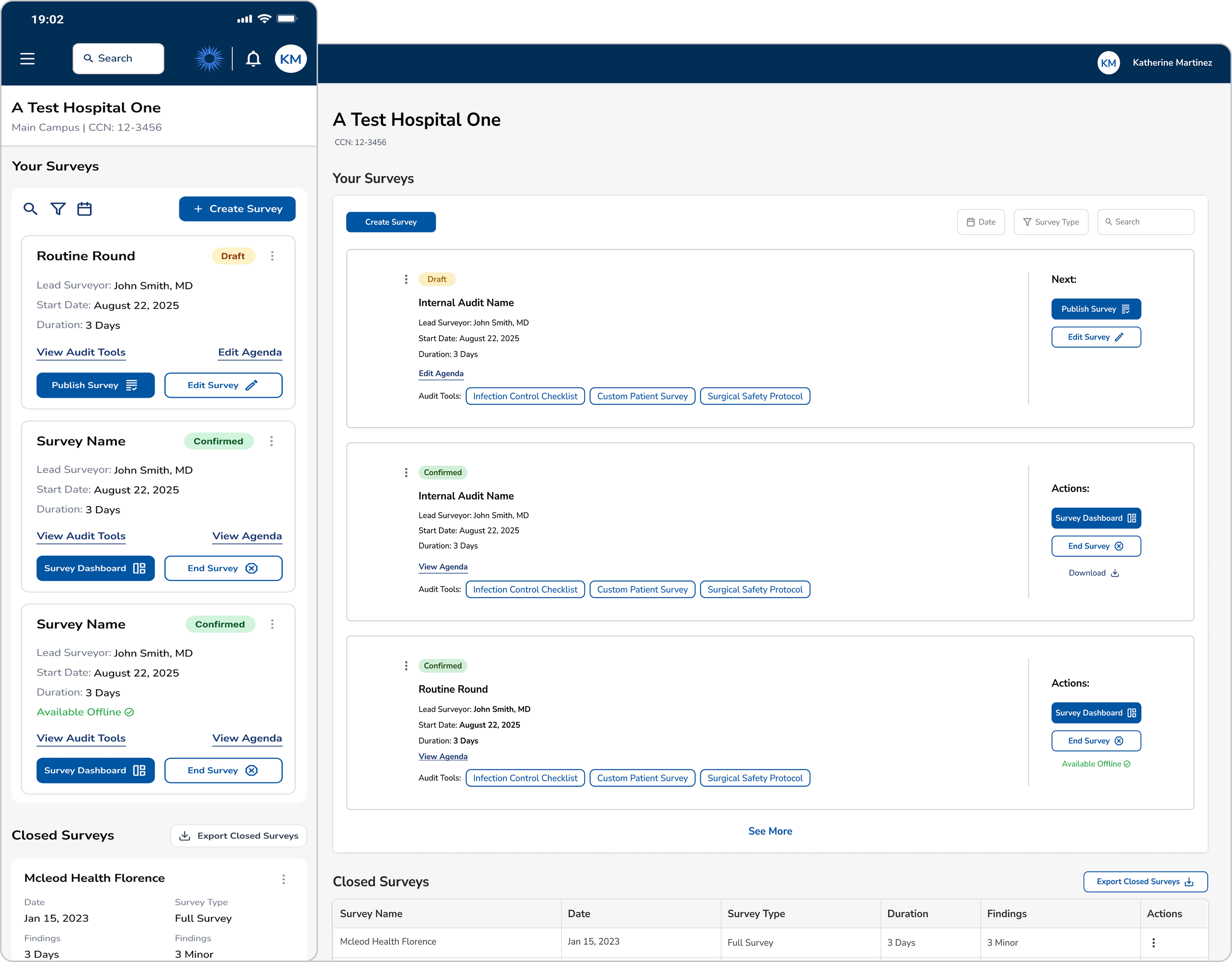
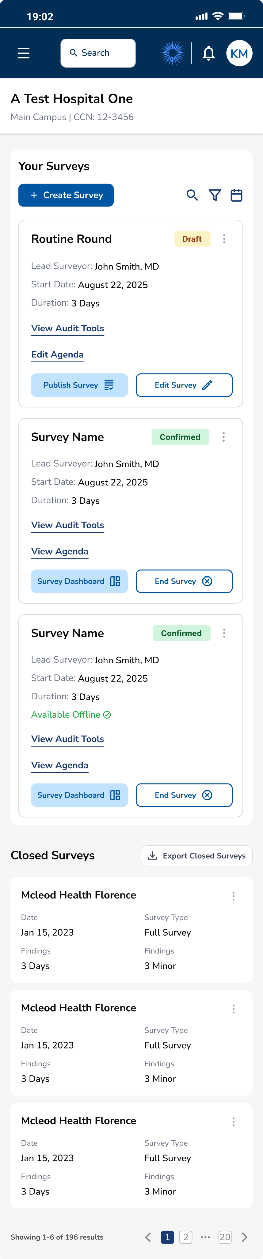
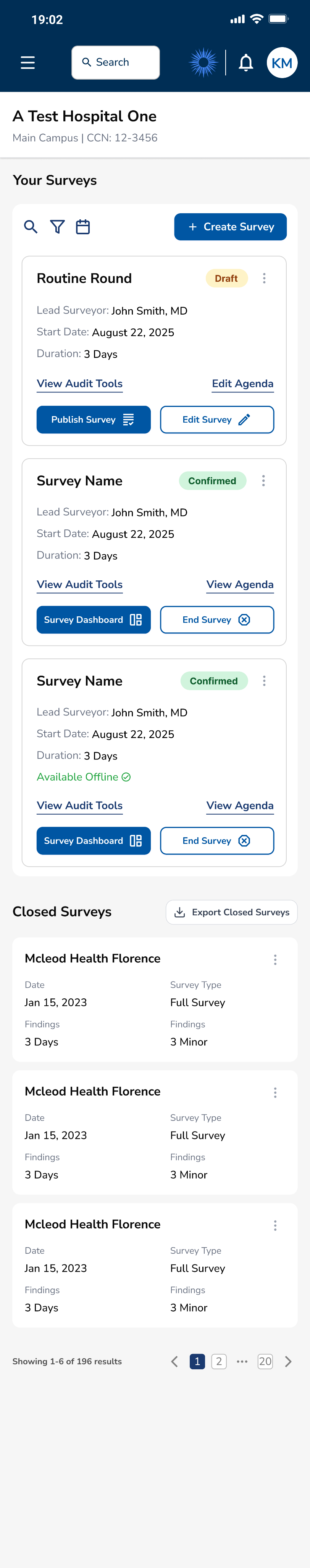
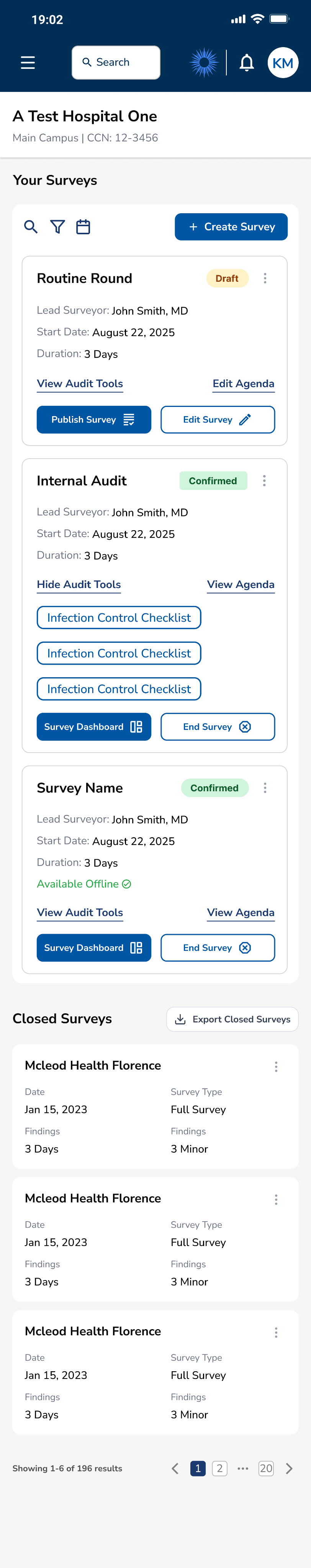
AFTER: CREATE SURVEY
Your Surveys

Create Survey

Search


Date

Survey Type
No Active Surveys

PM’s advocated for “Schedule” because surveys are not automatically live. But research showed this was confusing.
Our study showed how the repetition of "Create" better indicates the start of a new survey creation workflow.
Scalability first! This maintains consistency with the rest of the application where “Create” is primary CTA.
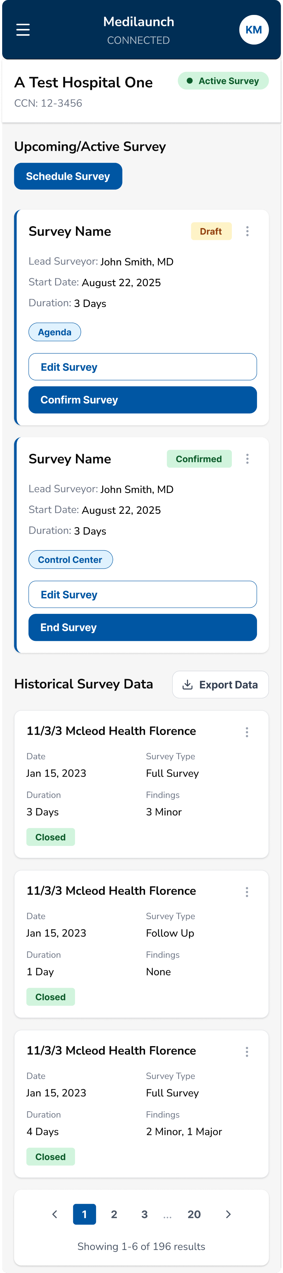
BEFORE: CONFIRM SURVEY
Survey Name
Draft

Lead Surveyor:
John Smith, MD
Start Date:
August 22, 2025
Duration:
3 Days
Agenda
Edit Survey
Confirm Survey
"Confirm" is used in multiple contexts in healthcare (appointment confirm, billing confirm).
Didn't convey the significant action of making survey live and accessible.
Users unsure if they could still edit after "confirming".
AFTER: PUBLISH SURVEY
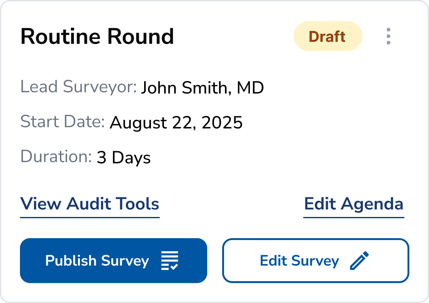
"Publish" clearly indicates the survey goes live and enters active state.
Using “Publish” reiterates the functionality of “Create”. The terminology validates each other by proving that creating a survey does not make it live.
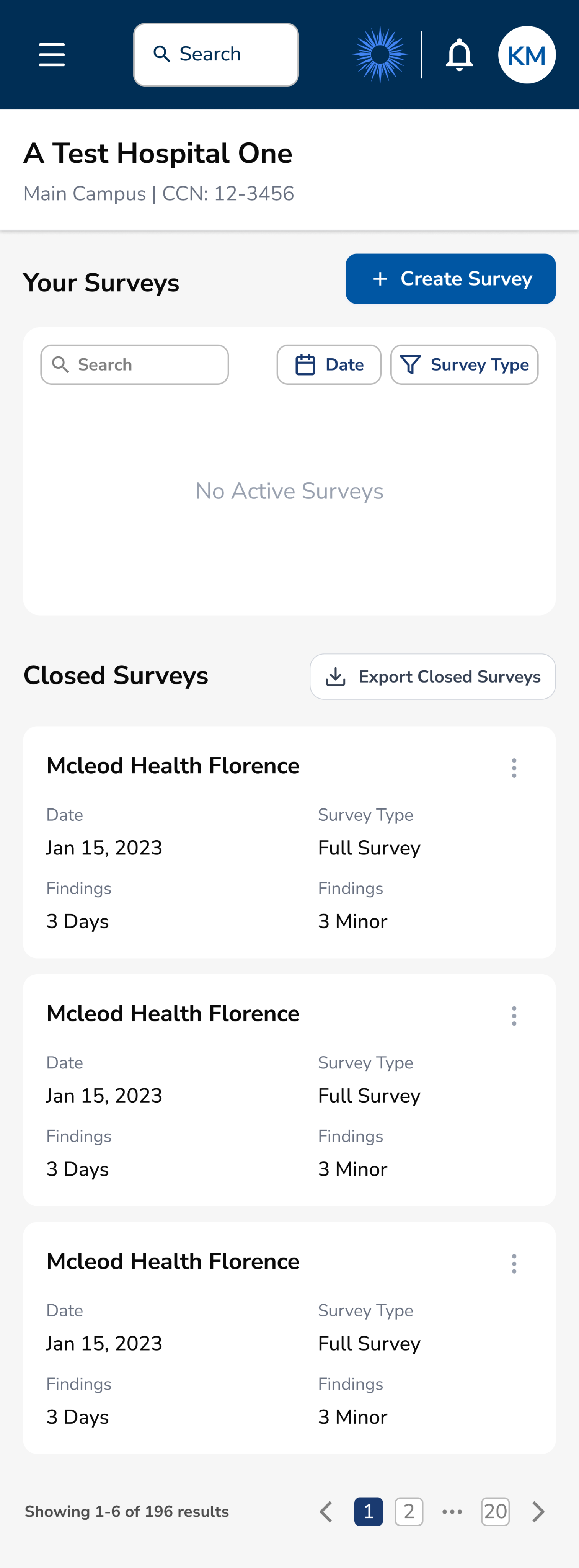
BEFORE: HISTORICAL DATA
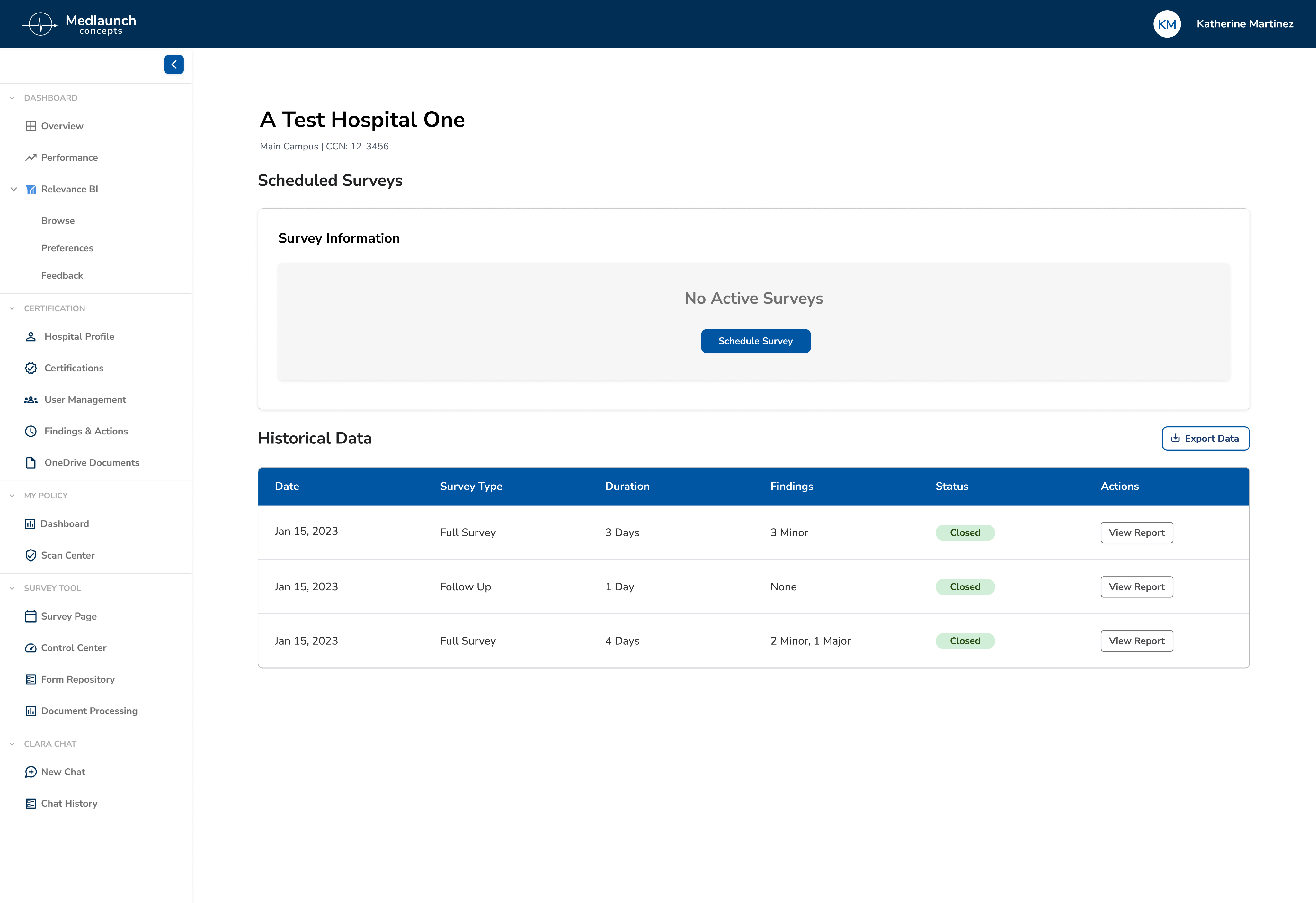
“Historical Data” felt vague and overly technical to users.
The label didn’t match the language surveyors and hospital staff used in their daily workflows.
AFTER: CLOSED SURVEYS
Closed Surveys
Export Closed Surveys

Survey Name
Date
Survey Type
Duration
Findings
Actions
Mcleod Health Florence
Jan 15, 2023
Full Survey
3 Days
3 Minor

Mcleod Health Florence
Jan 15, 2023
Follow Up
1 Day
None
Mcleod Health Florence
Jan 15, 2023
Full Survey
4 Days
2 Minor, 1 Major
Updated the label to better match the “Closed” status/action pill used across the experience for consistency.
The new name is more straightforward.
Button Naming Principles Established
As a team, we collaboratively developed comprehensive guidelines to steer the future development of our interface, ensuring consistency and usability.
Action-Oriented Language
Use clear verbs that describe the exact action (Create, View, Publish) rather than ambiguous terms (Schedule, Confirm, Launch)
Industry-Specific Precision
Avoid overloaded healthcare terms (Schedule, Confirm) that have specific regulatory meanings in compliance workflows.
Workflow Alignment
Match button labels to actual system behavior and workflow stage (View vs. Edit accurately reflects permissions). This helps to maintain consistency and scalability.
RE-TEST
Validation
Conducted a second round of usability testing with the same 4 tasks to validate improvements. Measured task completion rates and SUS scores to quantify the impact of design changes and ensure user needs were met.
BEFORE
Initial Testing Round
System Usability Score
59.4
D Marginal
Industry average: 68
User Confidence:
Low
Perceived Complexity:
High
Task Completion Rates
1
Create New Survey
50%
2
Edit Survey Details
25%
3
Publish and View Survey
88%
4
Complete/Close Survey
63%
AFTER
Post-Redesign Testing
System Usability Score
78.8
B+ Excellent
+19.4 points | +32.7%
User Confidence:
High
Perceived Complexity:
Low
Task Completion Rates
1
Create New Survey
100%
2
Edit Survey Details
88%
3
Publish and View Survey
100%
4
Complete/Close Survey
88%
Final Designs
Key Outcomes
Improved SUS from D to B+ in just two sprints.

Usability improvements directly contributed to securing new client.

Increased task success rates by +50 percentage points.
UI changes were applied application-wide, creating systemic change.
Impact on Mission
By addressing these critical usability barriers, the redesigned platform will significantly reduce administrative burden, allowing healthcare professionals to focus on what matters most: patient care.
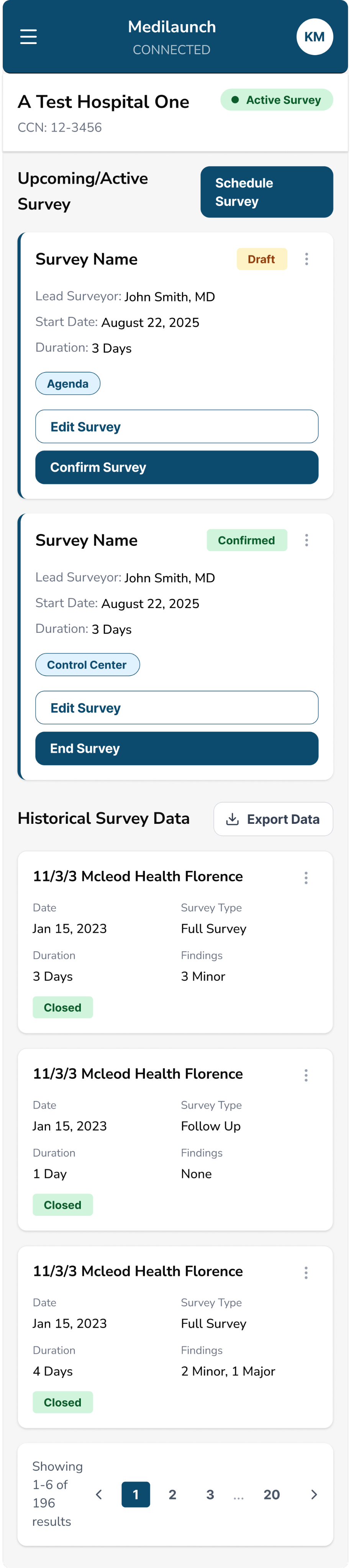
Mobile Flow
Desktop & Creation Form Flow
Impact
Average Task Completion Rate
+66.7%
Improved from 56.25% → 93.75%
SUS Score
+32.7%
Increased 59.4 (D) → 78.8 (B+)
Directly led to new client with
1,000+
hospitals now using the product
Next Case Study
Medlaunch Concepts
Reducing complexity with a unified QMS platform
Simplifying healthcare compliance with in-app product expansion of Quality Core, a unified view of overlapping accreditation workflows.
0 to 1 Design
Web & App
AI Agent
Healthtech

+25%
Expanded Product Suite
+7
Product Offerings
View Case Study


Medlaunch Case Study
Optimizing Survey Tool based on Usability Testing Research
I collaborated in the testing of Medlaunch’s survey tool and took leadership of redesigning this flagship product. Partnering with product, engineering, and data teams I ensured alignment with business goals, user needs, and scalability. I also took ownership of a scalable design system to maintain consistency as we continued to expand our in app-products and services.
Through cross-team collaboration, we delivered a full product redesign in under two sprint cycles, improving task success rates and usability for customers while directly contributing to securing a new client contract for Medlaunch.
Goals
01. Improve task success rates for survey workflows.
02. Simplify core accreditation flows to reduce cognitive load and support success in hospital demos.
03. Create scalable UX patterns to support long-term product growth and evolving user needs.
Average Task Completion Rate
+66.7%
56.25% → 93.75%
SUS Score
+32.7%
59.4 (D) → 78.8 (B+)
SUS Increased by
+19.4
Points
Overview

ROLE
Lead UX Designer

TIMELINE
Quarter 1, 2026 (1 Month)

COLLABORATORS
20+ team members:
UX Design, Product, Business, Data, & Engineering.

RESPONSIBILITIES
Product planning, UX research, UX & UI design
Original Design
New Redesign
The Challenge
Medlaunch's DNV Healthcare Portal helps hospital administrators and DNV accreditors track active, closed, and ongoing surveys (audits for hospital compliance). However, users were experiencing significant friction in critical workflows.
Survey Page Major Issues:
Critical Pain Points
Consistent confusion around terminology, status, and labels.
Vague hierarchy and weak CTA buttons prevent efficient survey creation.
Lack of flexibility for customization and filtering.
Survey workflow unclear and rigid, without ability to fix errors.
Problem to Solve
BUSINESS NEED
Enhance the product rapidly to meet deadlines for live demonstrations, enabling Medlaunch to secure new contracts and generate revenue as a startup under one year old.
USER NEED
Optimize task workflows to enable users to efficiently complete critical activities such as survey creation and processing.
Research
My mission was to redesign the survey management interface and conduct comprehensive usability testing to identify and resolve critical workflow barriers that were preventing users from efficiently completing their tasks. I conducted moderated usability testing, including both quantitative metrics (task completion rates) and qualitative feedback (SUS questionnaire, user observations).
8
Participants
4
Tasks Tested
60-75
Minute Sessions
Usability Test Results
Task Completion Rates
1
Create New Survey
50%
2
Edit Survey Details
25%
3
Publish and View Survey
88%
4
Complete/Close Survey
63%
8
6
4
2
0


Task 1
Task 2
Task 3
Task 4
Pass
Fail
System Usability Scale (SUS)
Numbers in cells represent participant number
Disagree
Nuetral
Agree
1
2
3
4
5
1. I think that I would like to use this product frequently.
8
4-6
3, 7
1, 2
2. I found the product unnecessarily complex.
2-4
1, 7
8
5
3. I thought the product was easy to use.
2
1, 3-8
4. I think that I would need to consult a senior to be able to use this product effectively.
4-7
3, 8
1, 2
5. I found the various functions in this product were well implemented.
1, 2, 4
6-8
3, 5
6. I thought there was too much inconsistency in this product.
5
6
1-4
7, 8
7. I would imagine that most hospitals with a need to do audit and compliance would learn to use this product very quickly.
3-5, 8
7, 8
2
1
8. I found the product very cumbersome to use.
2-8
1
9. I felt very confident using the product.
2
1, 3
4-8
10. I would need to learn a lot of things before I could get going with this product.
4
3, 5-7
1, 2, 8
System Usability Score
59.4
D Marginal
Industry average: 68
User Confidence:
Low
Perceived Complexity:
High
Insights
Survey Overview Learnings
UNCLEAR TERMINOLOGY
Insight: Users were confused by button labels/actions.
Action: Simplified language based on testing. Created terminology style guide to ensure ongoing consistency.
VAGUE CALL TO ACTION
Insight: Users struggled to use “Schedule Survey” button.
Action: Update label text. Position more prominently, following familiar design patterns.
LACKING HIERARCHY & CLARITY
Insight: Color not used to convey meaning.
Action: Redesign color hierarchy to enhance usage.
Survey Creation Form Learnings
GUESSING REQUIREMENTS
Insight: Users lacked information about required fields.
Action: Implement input field subtext and edge case solutions.
UNFAMILIAR DESIGN PATTERNS
Insight: Users were confused by date picker UI.
Action: Convert to industry standards.
PROBLEM SOLVING
Insight: Users felt dead-ended when faced with adding teammates to a survey.
Action: Integrate invite users dropdown into flow without redirecting.
Survey Management Learnings
UNFAMILIAR PATTERNS
Insight: Users were overwhelmed by organization.
Action: Group like functions together and follow familiar design patterns.
UNBALANCED LAYOUT
Insight: UI like color or placement fail to convey meaning.
Action: Relocate CTA, status chips, actions. Hide unnecessary UI elements and data.
UNCLEAR NEXT STEPS
Insight: Users struggled to understand, complete, or undo actions in next steps.
Action: Update actions according to survey progress and disable buttons that are pending prior actions.
Key Objectives
Improve usability score from D (59.4) to B (70-80).
Increase task success rates with clearer labeling & workflows.
Reduce learning curve for new users with familiar patterns.
Prioritize customization to enable multiple success paths.
Design Process
Based on usability testing insights, I implemented an iterative design approach focused on addressing critical user pain points while collaborating closely with cross-functional teams to ensure technical feasibility and business alignment.
ITERATION
Based on Testing
Following initial usability testing results, I implemented targeted design improvements addressing each identified pain point. Changes included updating button labels, improving visual hierarchy, and adding missing functionality like search and filters.
Original Design
Iteration 1
Iteration 2
Iteration 3
COLLABORATION
Cross-Functional Partnership
Collaborated closely with product managers on terminology and button label updates, worked with developers to streamline rapid handoff, and partnered with field team to ensure they understood upcoming demo changes. Regular check-ins balanced design goals with technical constraints.
Collaboration
TEAMWORK
We collaborated throughout the design process in small teams (e.g. product planning meeting of 3) and large (front-end group calls of 10+).
PRODUCT PLANNING
Major points in product meetings highlighted label terminology in the medical context and scalable design.
GUIDELINES, HANDOFF & SCALABLITY
Button labels and UI for this product were pushed system wide. Together we created documentation guidelines in our design system for terminology and components.
Product Planning & Terminology Guidelines
BEFORE: SCHEDULE SURVEY
Scheduled Surveys
Survey Information
No Active Surveys
Schedule Survey
“Schedule” implied setting a date/time only, not initiating a survey.
Users expected a calendar interface rather than a survey builder.
Ambiguous for compliance workflows where “scheduling” has specific regulatory meaning.
AFTER: CREATE SURVEY
Your Surveys
Create Survey
Search
Date
Survey Type
No Active Surveys
PM’s advocated for “Schedule” because surveys are not automatically live. But research showed this was confusing.
Our study showed how the repetition of "Create" better indicates the start of a new survey creation workflow.
Scalability first! This maintains consistency with the rest of the application where “Create” is primary CTA.
BEFORE: CONFIRM SURVEY
Survey Name
Draft
Lead Surveyor:
John Smith, MD
Start Date:
August 22, 2025
Duration:
3 Days
Agenda
Edit Survey
Confirm Survey
"Confirm" is used in multiple contexts in healthcare (appointment confirm, billing confirm).
Didn't convey the significant action of making survey live and accessible.
Users unsure if they could still edit after "confirming".
AFTER: PUBLISH SURVEY
"Publish" clearly indicates the survey goes live and enters active state.
Using “Publish” reiterates the functionality of “Create”. The terminology validates each other by proving that creating a survey does not make it live.
BEFORE: HISTORICAL DATA
“Historical Data” felt vague and overly technical to users.
The label didn’t match the language surveyors and hospital staff used in their daily workflows.
AFTER: CLOSED SURVEYS
Closed Surveys
Export Closed Surveys
Survey Name
Date
Survey Type
Duration
Findings
Actions
Mcleod Health Florence
Jan 15, 2023
Full Survey
3 Days
3 Minor
Mcleod Health Florence
Jan 15, 2023
Follow Up
1 Day
None
Mcleod Health Florence
Jan 15, 2023
Full Survey
4 Days
2 Minor, 1 Major
Updated the label to better match the “Closed” status/action pill used across the experience for consistency.
The new name is more straightforward.
Button Naming Principles Established
As a team, we collaboratively developed comprehensive guidelines to steer the future development of our interface, ensuring consistency and usability.
Action-Oriented Language
Use clear verbs that describe the exact action (Create, View, Publish) rather than ambiguous terms (Schedule, Confirm, Launch)
Industry-Specific Precision
Avoid overloaded healthcare terms (Schedule, Confirm) that have specific regulatory meanings in compliance workflows.
Workflow Alignment
Match button labels to actual system behavior and workflow stage (View vs. Edit accurately reflects permissions). This helps to maintain consistency and scalability.
RE-TEST
Validation
Conducted a second round of usability testing with the same 4 tasks to validate improvements. Measured task completion rates and SUS scores to quantify the impact of design changes and ensure user needs were met.
BEFORE
Initial Testing Round
System Usability Score
59.4
D Marginal
Industry average: 68
User Confidence:
Low
Perceived Complexity:
High
Task Completion Rates
1
Create New Survey
50%
2
Edit Survey Details
25%
3
Publish and View Survey
88%
4
Complete/Close Survey
63%
AFTER
Post-Redesign Testing
System Usability Score
78.8
B+ Excellent
+19.4 points | +32.7%
User Confidence:
High
Perceived Complexity:
Low
Task Completion Rates
1
Create New Survey
100%
2
Edit Survey Details
88%
3
Publish and View Survey
100%
4
Complete/Close Survey
88%
Final Designs
Key Outcomes
Improved SUS from D to B+ in just two sprints.
Usability improvements directly contributed to securing new client.
Increased task success rates by +50 percentage points.
UI changes were applied application-wide, creating systemic change.
Impact on Mission
By addressing these critical usability barriers, the redesigned platform will significantly reduce administrative burden, allowing healthcare professionals to focus on what matters most: patient care.
Mobile Flow
Desktop & Creation Form Flow
Impact
Average Task Completion Rate
+66.7%
Improved from 56.25% → 93.75%
SUS Score
+32.7%
Increased 59.4 (D) → 78.8 (B+)
Directly led to new client with
1,000+
hospitals now using the product
Next Case Study
Medlaunch Concepts
Reducing complexity with a unified QMS platform
Simplifying healthcare compliance with in-app product expansion of Quality Core, a unified view of overlapping accreditation workflows.
0 to 1 Design
Web & App
AI Agent
Healthtech

+25%
Expanded Product Suite
+7
Product Offerings
View Case Study